Designing an app to help people eat 30 different plants each week

Project Overview
Project Type: App Design
Role: UX/UI Design, Branding
Industry: Lifestyle & Wellness
Team: Independent Project
Time: 1 month
Tools: Figma, Google Forms, Otter, Lyssna, Photoshop
Context:
Public awareness of the gut microbiome's link to a plant-based diet is growing, with many seeking to eat more plants.

Problem Identified:
Despite the well-documented advantages of a plant-diverse diet, many seem to struggle to incorporate a sufficient variety of whole plants This is perhaps due to limited knowledge, lack of culinary skills, and prevalence of processed foods.
Supporting Info:
Studies suggest that a diet rich in a diverse array of plants is linked to a lower risk of chronic diseases.
The American Gut Project conducted a study that revealed individuals who consumed more than 30 different plant types per week had a healthier microbiome.
Research
Methods: Competitive Analysis, Survey, User Interviews
Research Goal:
I wanted to determine if people had a desire to eat more plants than they currently eat, and if so, what pain points or blockers kept them from doing so.
Research Objectives:
Gauge user desire to eat more variety of plants
Discover pain points users may face in trying to incorporate more plants into their diets
Learn about users’ understanding of health benefits related to eating a diverse range of plant foods
Understand user expectations and interests in regard to wellness apps
Determine what methods of tracking could be most engaging for users
Scope out competitor apps and assess their strengths and weaknesses
Competitive Analysis
I downloaded and tested a few of the most popular apps that aim to solve the problem I had identified, then assessed and compared the design, offerings, and features of each.
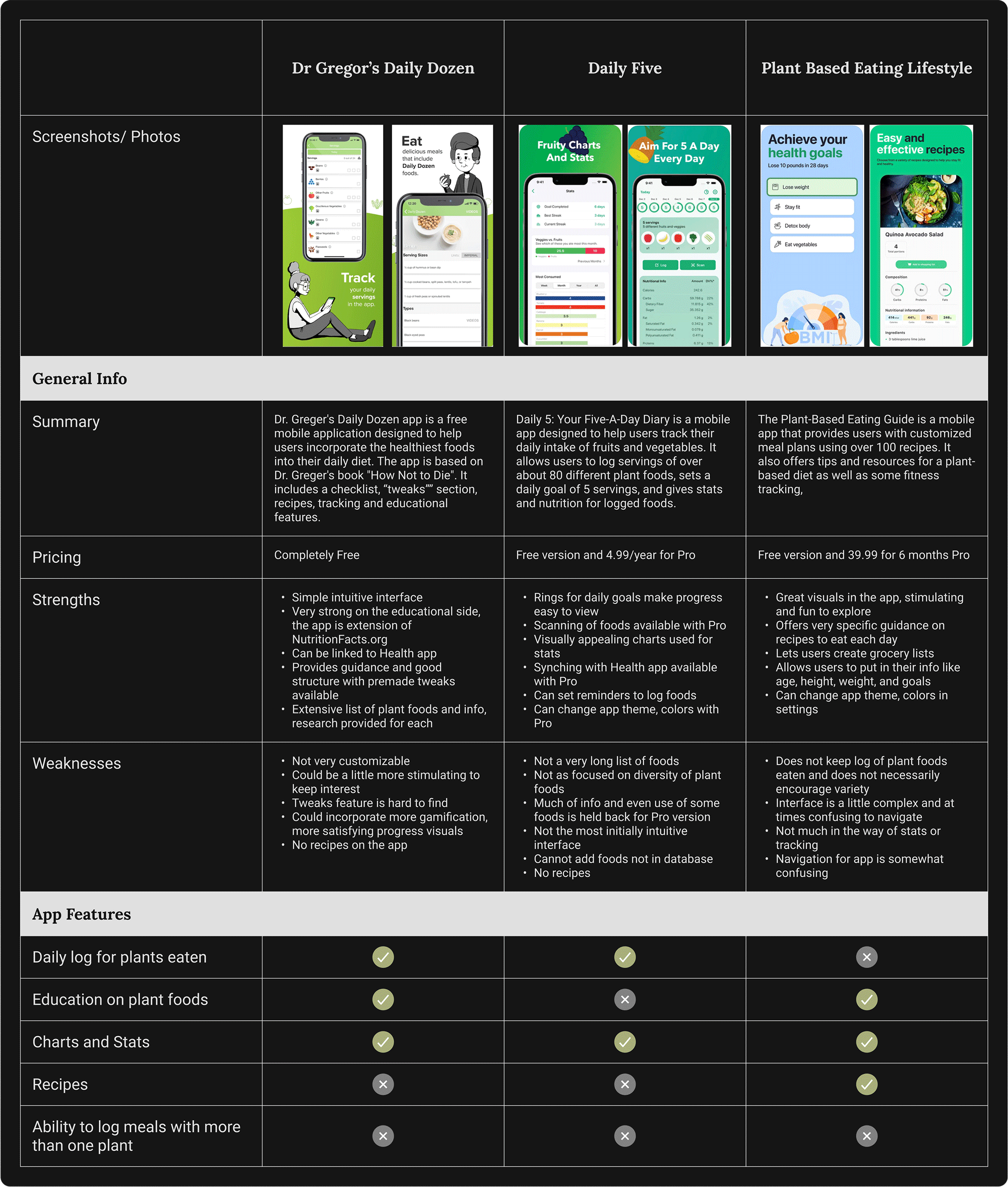
Competitive Analysis Summary:
There were a few different apps available that set out to help users eat more plants. While these apps provide great resources for incorporating more plant foods, there are clear opportunities where a new app could fill in the gaps.
Existing apps require logging each plant ingredient individually; meal logging isn’t available.
Users want more customization options.
Apps could better promote dietary variety for health.
A new app could introduce users to diverse plants and suggest ways to include them in their diets.
By addressing areas where existing apps are lacking, and bringing together the strongest features they offer, a new app could stand out as a comprehensive solution for adopting a more diverse, plant-rich diet.
Survey
I created a 4-question survey which I sent out remotely via Google Forms, asking users what their level of interest was in eating more plants, and what issues, if any, they were facing in this regard.
Total Participants: 20
Ages: 22-70
Key Takeaways:
90%
said were “very interested” in incorporating more variety of plants such as fruits, vegetables, grains, nuts, seeds, herbs, and spices into their diets.
60%
cited lack of convenience as a reason for not hitting plant variety goals. Other top reasons were cost concerns and lack of familiarity with foods.
User Interviews
I prepared several interview questions and spoke one-on-one with five different potential users. I used Otter AI to record and transcribe the conversations in order to later review and synthesize the information.
My strategy for these interviews was to start out broad by first asking users about diet and their feelings on plant foods, and gradually working toward more specific questions about user preferences in regard to wellness and tracking tools.
Total Participants: 5 (3 female, 2 male)
Ages: 18-24 (1), 45-54 (3), 65+ (1)
Participant Info
Varying levels of interest in health and wellness, all at least have some desire for a healthy diet
None diagnosed with any disordered eating
None practice any uncommon diets and they all regularly eat plants as part of their current diets
Moderately to highly tech-savvy
None are experts on diet or nutrition
Learnings:
Participants showed strong interest in diversifying their diets but actually struggled with ideas for meals and preparation, more than the effort of cooking itself.


Users all expressed a desire to eat more plants
Users would like to know what the benefits are of individual plant foods
30 plants in a week sounded daunting to some users
Users know they should have a range of color in their diet and eat mostly whole foods
Users need logging to be extremely simple to work
Users like to see rings for tracking progress
Users are interested in seeing what data looks like over larger ranges of time
Getting ideas for recipes and plants to try is desired
Some users have had negative experiences with tracking food and don’t like to be thinking or obsessing about food constantly.
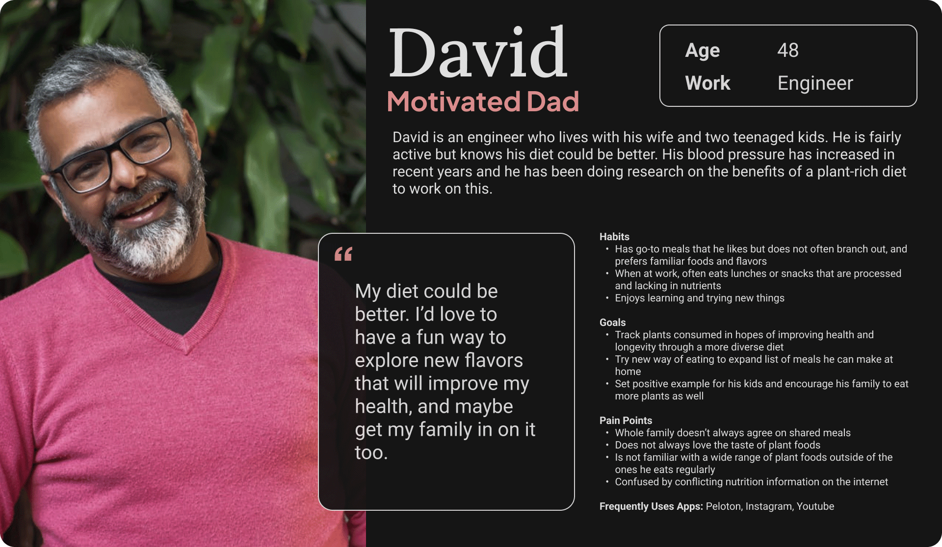
Personas
From these themes I then formed two personas to represent potential users for this product

Problem Statement
My next step was to determine my exact problem and state it clearly.

Ideation
Project Goals
Before ideating on features I clarified the goals for both the user and the business, and made note of potential technical constraints.
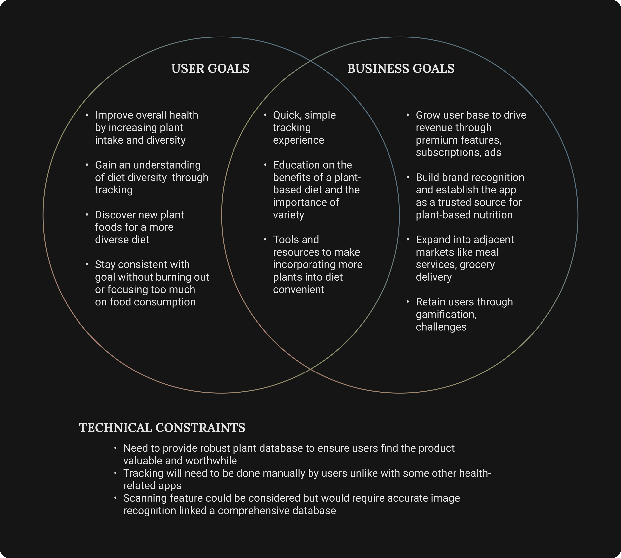
I had several ideas for how to approach the problems discovered in research, but the challenge would be narrowing down the most important features for the MVP.
Features Roadmap
There were many potential features that aligned with the research, so I spent quite a bit of time here moving these features around, and even did so after moving on to information architecture. I made sure the must-have features for this MVP had the strongest supporting data. Below is the roadmap I ultimately landed on, sorted by priority.
Design and Prototype
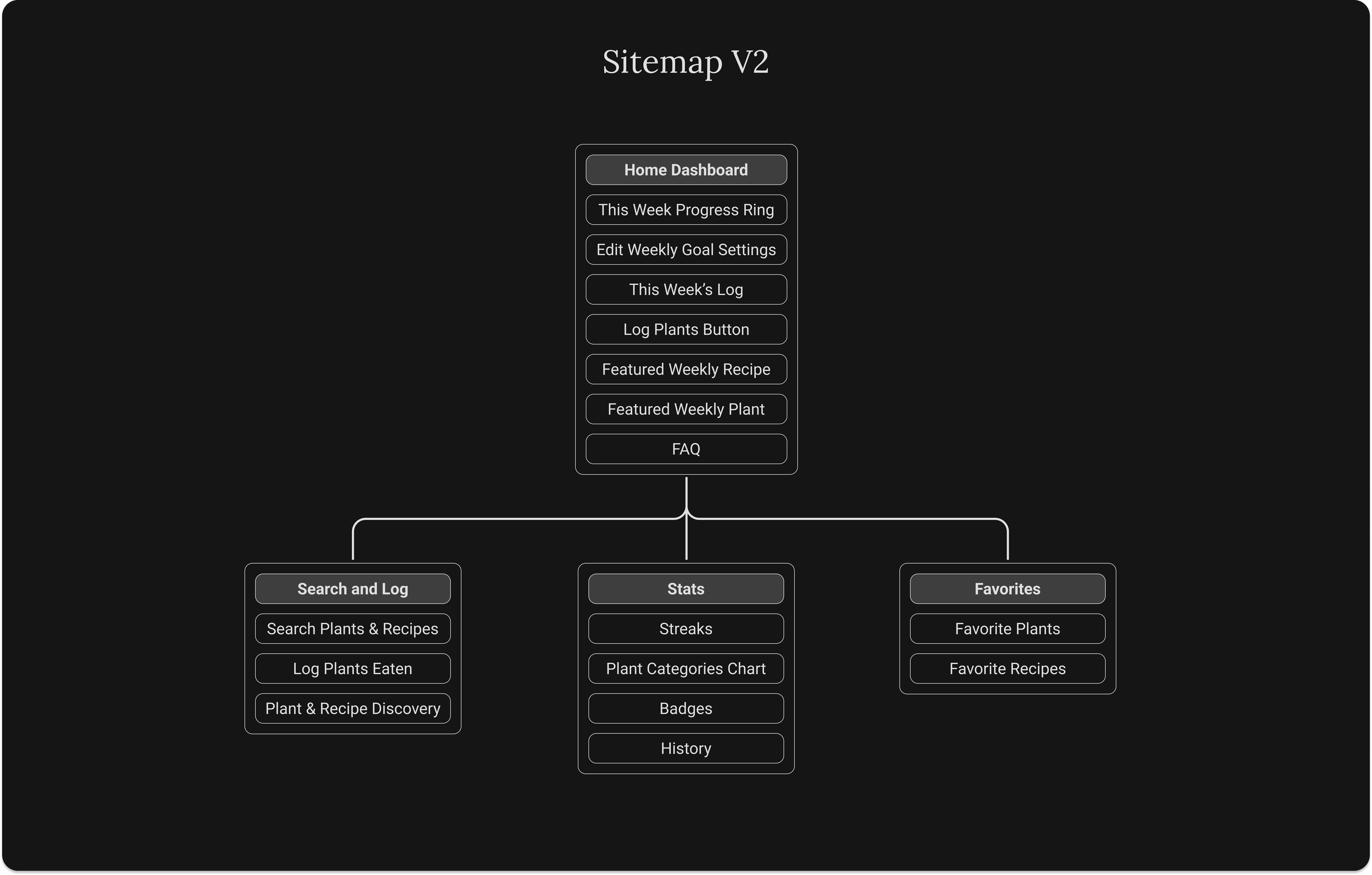
Information Architecture - Sitemap
With my features defined, I began mapping out the app structure. There was a lot of iteration that took place in terms of architecture. I believed it was important to allow users the ability to log multiple plants at a time, so initially I planned to allow users to create and log their own multi-plant meals. This would change after some low-fi testing. V1 of the sitemap is shown below.

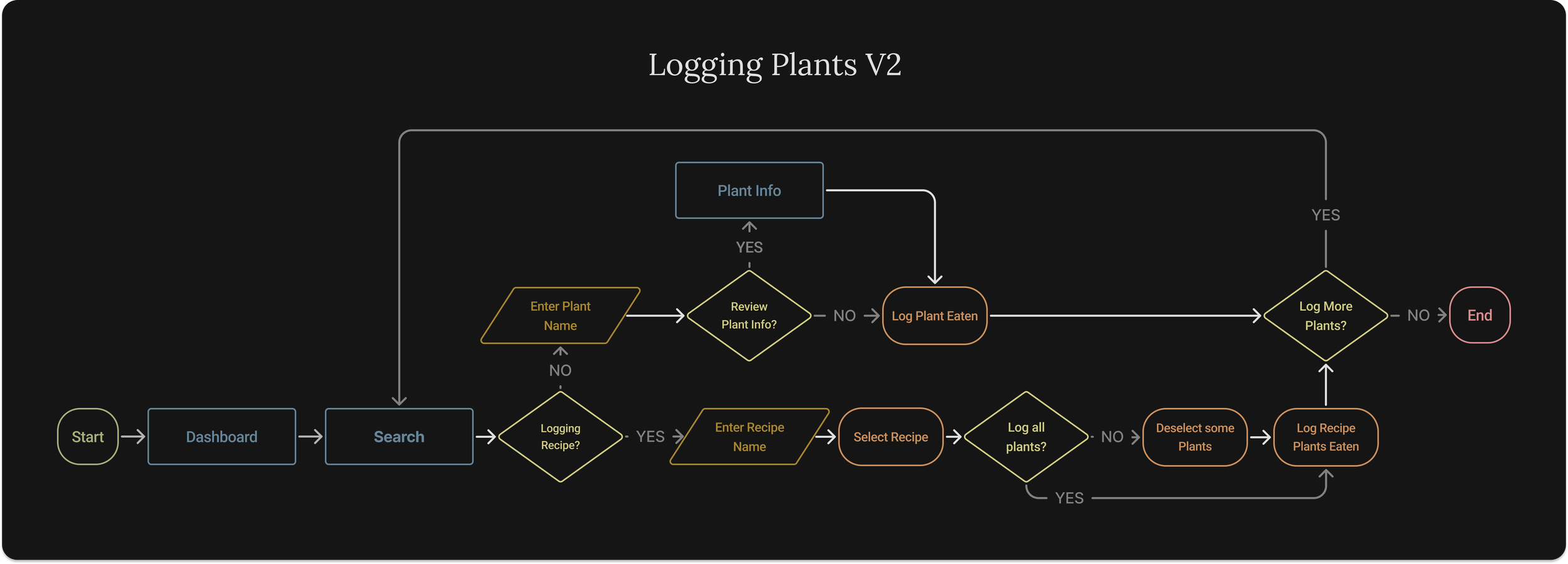
User Flow
I mapped out the flow for logging plants. Below is the first version based on my initial plan which was more focused on allowing users to create and log their own meals.

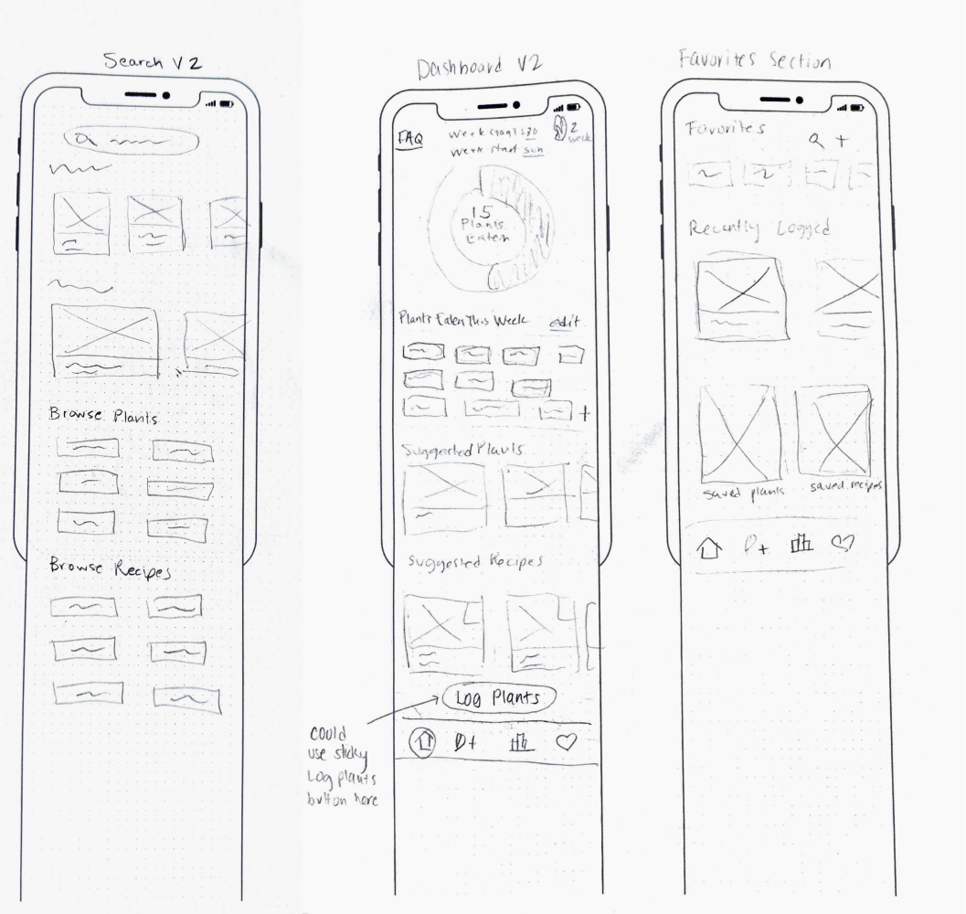
Lo-Fidelity Sketches
With flows mapped out, I began sketching out my ideas for the key screens. For the plant index and search functions, I drew up several different ideas.

I wanted to ensure my designs fully addressed the problem, so I revisited my interview participants with lo-fi sketches for feedback. This critical step helped me confidently pivot and refine key aspects of the app design.
Lo-Fidelity User Testing
I walked my original interview participants from interviews through my sketches and asked them several questions. I also shared these sketches with a few of my peers and my mentor at this point. Below are my detailed test results.

Key Iterations
After discussing the sitemap with peers, I decided to remove the ‘More’ section of the site for MVP as these aspects are nice to have but not core features of the app.
In response to lo-fi testing and review of initial research I determined that the ‘Create a Meal’ feature should be eliminated for the MVP. A key pain point for users was their lack of familiarity with different plant foods and a feeling that these were less convenient foods to prepare. The ‘Recipes’ section can replace logging a multi-plant meal for this version to better address this issue.
While ease of logging was a main concern, this could be accomplished for a weekly log without saving multi-plant meals. Furthermore, the concept of re-usable meals that you eat often also seems to go against the key goal of the app which is to promote diversity in one’s diet.
I decided to combine ‘Recipes’ and the ‘Plant Index’ into a ‘Search’ section and have this section focus more on discovery and browsing. In this section, users can log what they have eaten but also get ideas for new plants to try and how to prepare them.
Branding
Based on overall goals and personas, I determined my core brand values for this app and searched for inspiration. I was drawn to health and wellness apps that use a dark theme. I was aiming for a sleek look that would evoke ideas of wellness, knowledge, growth, and accomplishment. I also wanted to create some geometrical, kaleidoscopic illustrations that would hint at the idea of the microbiome and diversity.


UI - Style and Components
For the visual design, much of the work was adjusting colors to pair with the dark background while also ensuring the different UI components appeared harmonious with the various food images. I chose less saturated colors which blended well with the organic look of the images. Using a very dark gray for the background allowed for the application of subtle drop shadows that create some visual hierarchy. Icons and strokes of UI elements are slim and minimal to create the sleek appearance.
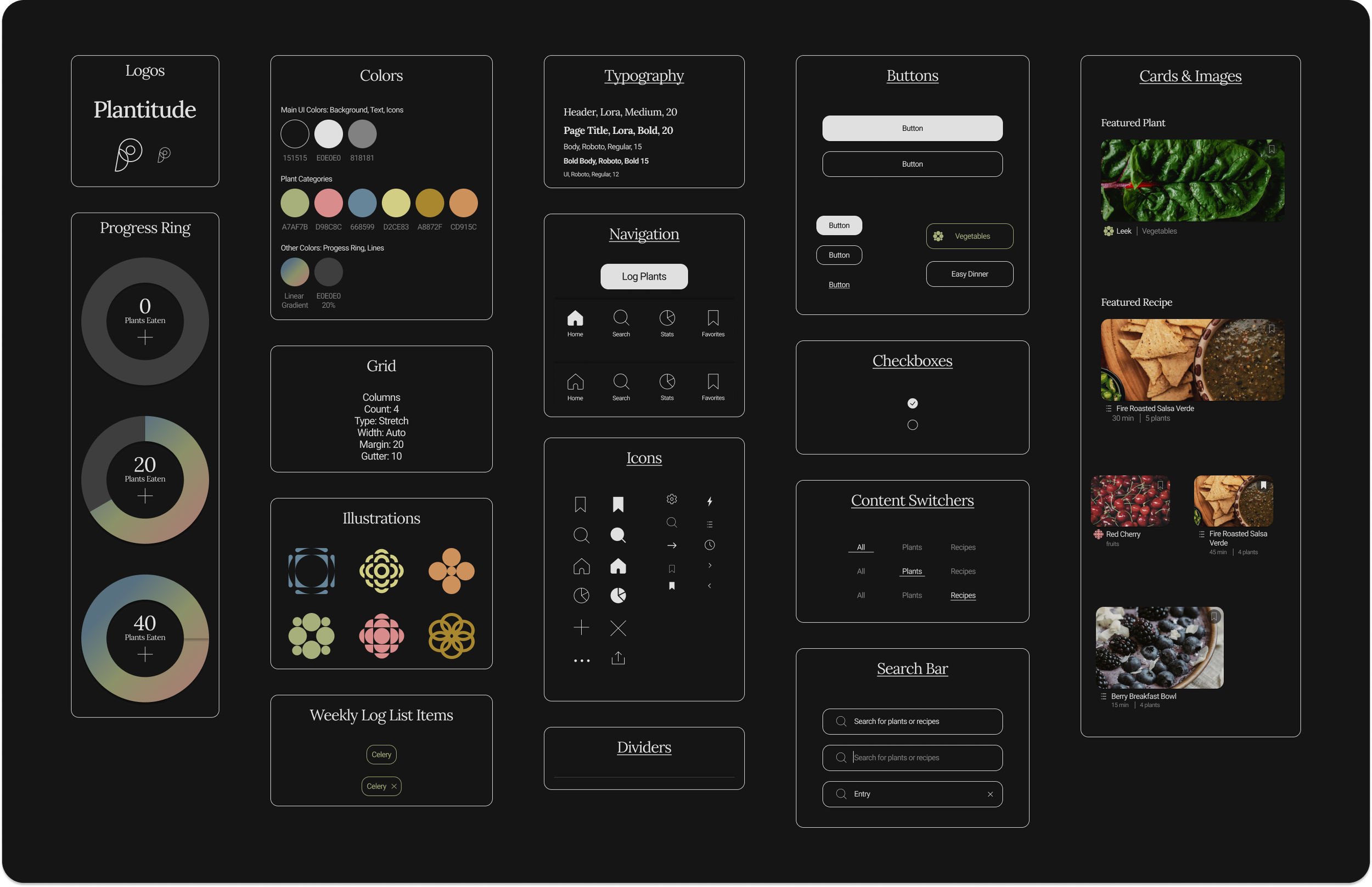
Hi-Fidelity Wireframes
For this project I chose to move directly into hi-fidelity wireframes from my sketches since I was able to gather strong feedback from lo-fidelity testing. Below are my final wireframes.
Testing & Iteration
Hi-Fidelity Usability Testing
I created a prototype in Figma and conducted hi-fidelity usability testing of key features.
Number of Participants: 7
Tool: Lyssna
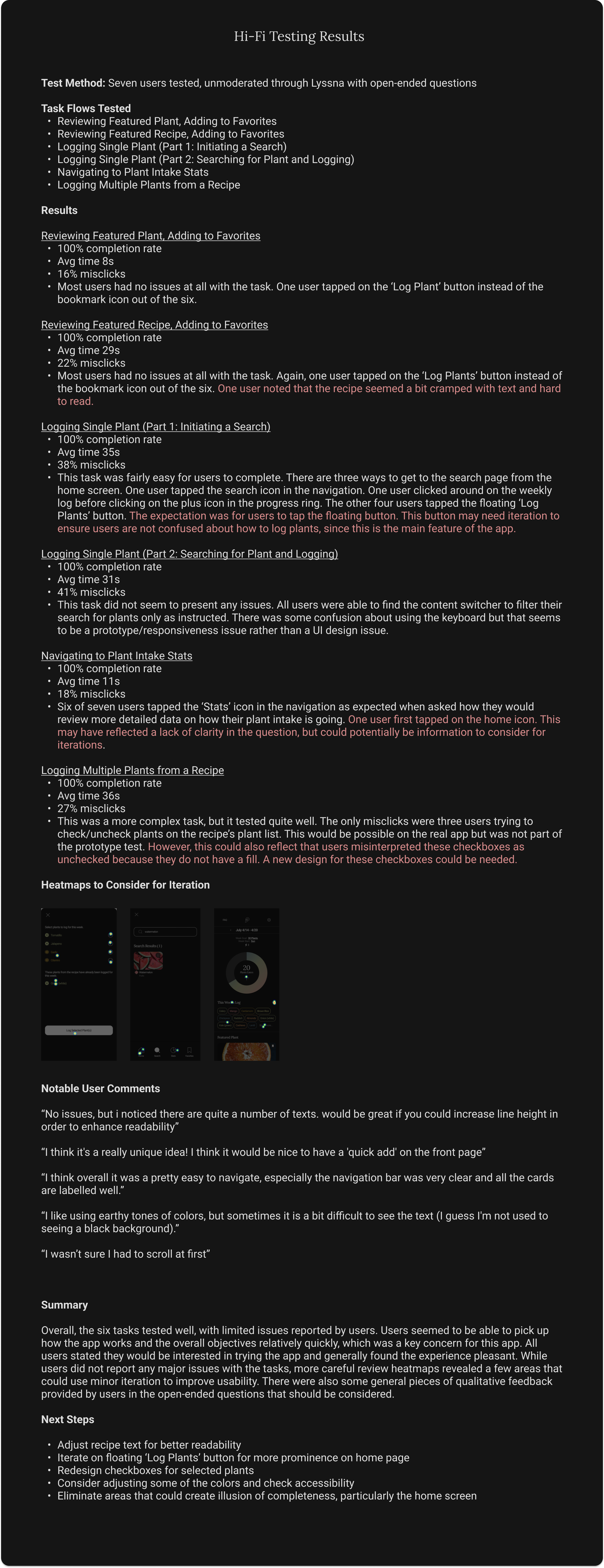
Iteration
After analyzing the qualitative and quantitative insights gathered from testing, I made further iterations to directly address test results. Testing went well overall, and users reported a positive experience, but some minor iterations were made to improve usability.

Final Prototype
Reflection
This project was in many ways about challenging myself as a designer. I chose to approach a topic and design style that was somewhat out of my comfort zone with the intention of expanding my range of UX/UI design skills. I am also happy that I was able to question my design ideas at an early stage and make some major adjustments to the overall architecture and focus of the app to better serve user needs. Because of this pivot at the lo-fidelity stage, only minor iterations were needed at hi-fidelity. As mentioned earlier in this case study, there are many more features I would love to add to this app design in the future, but I am pleased with this version of the product and feel it could help users improve their diets and overall health as it stands.