
Mobile-first design for a digital home manual
Project Overview
Project Type: Mobile-first site design
Role: UX/UI design, branding
Industry: Home organization
Team: Independent project
Time: 2 months
Tools: Figma, Mural, Google Forms, Optimal Sort, Whimsical, Maze, Photoshop
Context:
While working in real estate, I noticed that most sellers had failed to keep track of information about their homes when it came time to list.

Examples of Possible Home Information:
details on repairs or renovations and colors used
important documents
measurements of rooms or furniture
specs of appliances such as battery types or parts
home maintenance tasks
Problem Identified:
People often struggle to keep track of information related to their homes, even though this information can be helpful for completing everyday tasks, or when eventually buying and selling a home.
🏠 🧑🔧 🗒️ 📏 🔋 🎨
Research
Methods: Competitive Analysis, Survey, User Interviews
Research Goal:
I set out to determine what type of information users would benefit from tracking, and the optimal structure for logging home information.
Research Objectives:
What aspects of a home do potential users find important or valuable to keep a record of, if any?
What are the barriers, frustrations, or mental blocks that currently keep potential users from tracking certain data about their homes?
What methods are being used currently to track this type of information? Is tracking done digitally, physically, mentally, etc.?
What competitor tools currently exist, where have they succeeded, and where they are lacking?
Competitive Analysis
First, I downloaded and reviewed some popular products currently offered to help track home info. I took a look at their various features as well as reviews from users of the app in order to understand their strengths and weaknesses, and ultimately identify potential opportunities in the market.
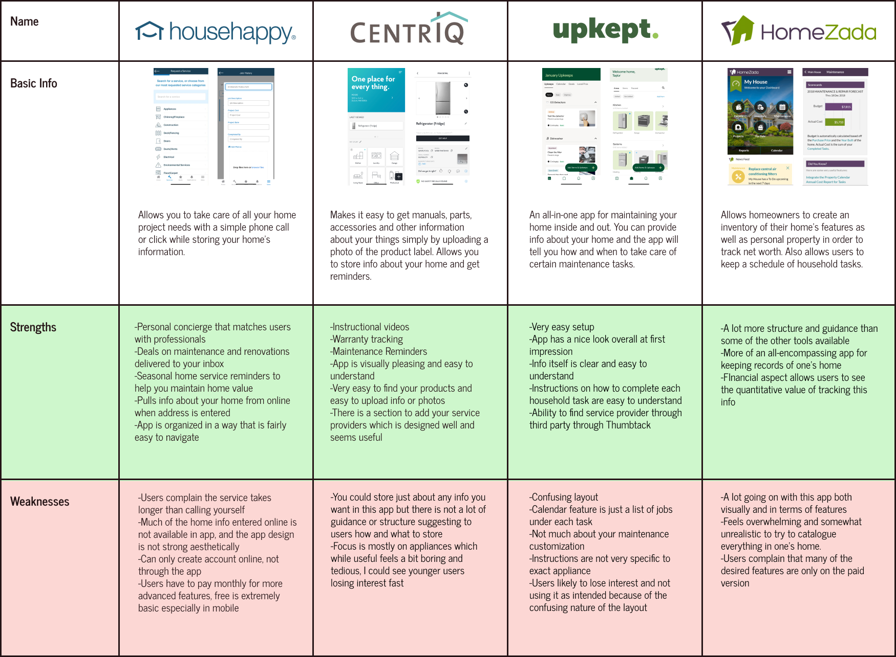
Key Takeaways: Each of the competitors had some element of storing home info, however most focused more on another feature such as repairs, appliances, or maintenance. Most of these did not offer much structure or guidance for users in terms of storing general information. One of the apps offers all of these features as well as some guidance, but feels and looks overwhelming to the user.
There is an opportunity to strike a nice balance between offering structure and allowing the service to be customizable to the individual user. A big challenge here will be keeping the interest of users and making the app worth using consistently. Most of the competitors leave a lot to be desired visually. More appealing UI elements could help keep users engaged.
Survey
I created a 10-question survey which I sent out remotely via Google Forms to gather basic information about potential users on a larger scale. This allowed me to start understanding potential user behavior and helped shape the script I would use for interviews.
Total Participants: 24
Ages: Ranged from 18-24 to 65+, 45.8% were between ages 25-34
Living Situation: 70.8% own their home
Household Number: 66.7% live with just one other person
Key Takeaways:
62.5%
This percentage of participants said they have wished they had info about their home handy while they were out.
The same percentage of participants said they could use guidance on what type of maintenance or cleaning schedule is needed for their home.
41.7%
This percentage of participants said they are deterred from tracking this type of info because they don’t know where to start and need guidance. 29.2% said it takes too much time.
User Interviews
Using a script of prepared questions, I spoke one-on-one with five different potential users. I recorded the audio of each interview and listened back later, gathering key findings and eventually determining recurring themes among potential users.
During interviews, I made sure to remain open and neutral in my responses. It is important to note that much of the information discussed around one’s home could be considered personal, and people may feel uncomfortable sharing. Some people may not be inclined to be completely honest about their lack of organization or motivation to track information if they fear judgement.
Total Participants: 5
Ages: 18-24 (1), 45-54 (2), 65+ (2)
Living Situation: 4 own their home, 1 rents
Household Number: All live with one other person
Learnings:
Upon sorting these insights, it became clear that home organization was deeply personal, and a major source of stress. Everyone interviewed seemed to strive for organization, but scattered methods, lack of communication between partners, and feeling overwhelmed got in the way.
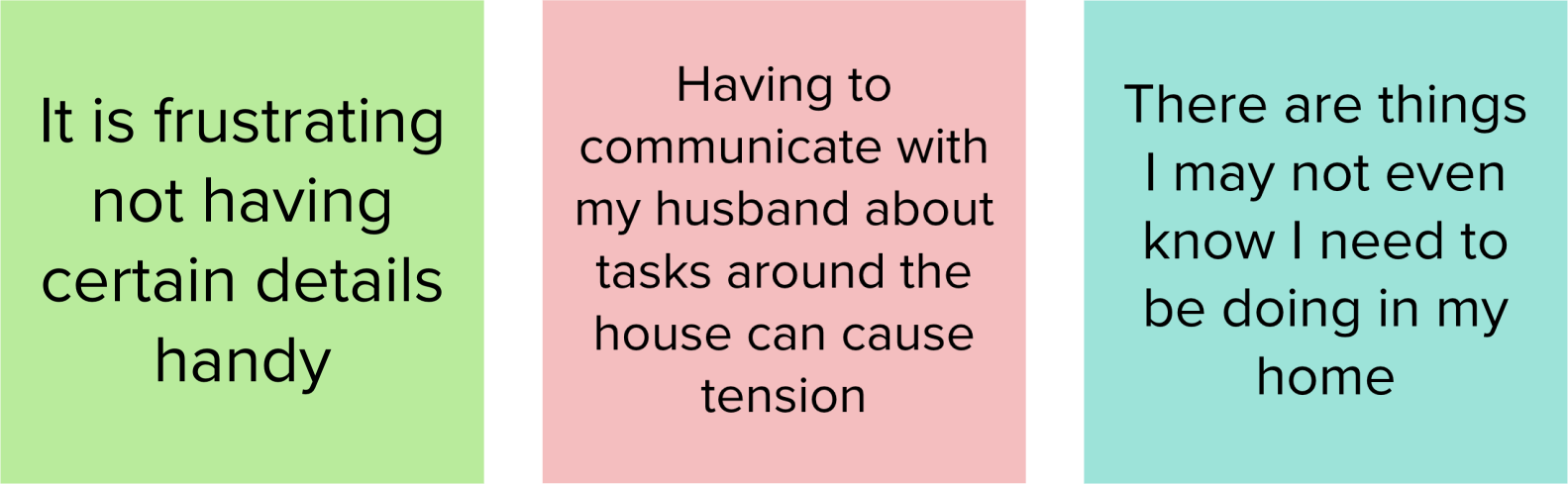

Users believe home organization is positive and healthy, but most hate spending time on it.
Current tracking methods vary greatly, and everyone is different.
Users feel irritated generally when they do not have the information they need, and dislike spending time searching for it.
There is a low level of excitement about this type of information.
Collaboration with partners is a key stressor.
There is some desire for guidance on home info and maintenance among users.
Others know what to do, but are overwhelmed.
Personas
From the themes that emerged, I then formed two personas to represent potential users for this product.


How Might We…
How might we guide and educate new, inexperienced homeowners in the process of keeping track of home information and tasks when they lack the knowledge and are feeling lost?
How might we reduce tension and stress around organizing information and tasks around the home for couples who live together but have differences in how they prefer to organize, approach, and complete tasks?
How might we increase the motivation for keeping home information and tasks organized for more experienced homeowners who may feel burnt out or overwhelmed by the amount of information and tasks they have, or apathetic as the excitement of home ownership has worn off?
Ideation
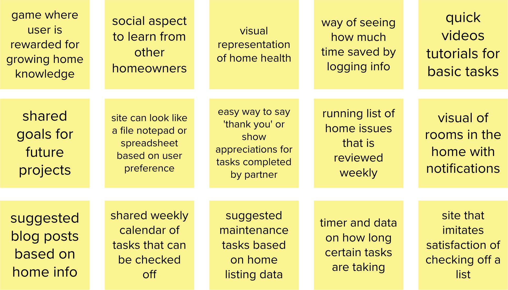
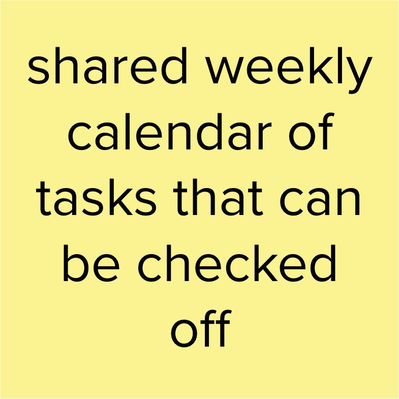
Brainstorm
Referencing my “how might we” questions, I started loosely brainstorming ideas for how these pain points could potentially be addressed. I found that some ideas could apply to multiple pain points at once.
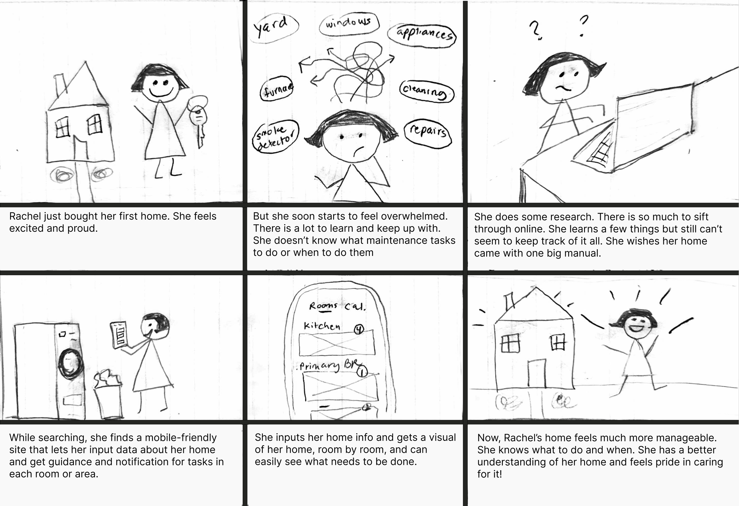
Storyboards
From here, I pulled out the ideas that I believed could best solve user problems at hand, and began creating storyboards that helped me envision the user journey and positive impact of this product.


Project Goals
Next, I needed to take a step back and clarify the goals of this project in the context of my research discoveries. I wanted to make sure that these goals were aligned before making more specific decisions about the site.

As my ideas started to take shape, I began to identify a few important challenges that I was facing. I talked through how I would approach each one with my mentor and peers.
Is this for Renters?
Would this app be of interest for people who rent their home? Renters generally have less home info to track and few items they are responsible to maintain. However, during interviews and group discussions with peers, I found that renters do also struggle with feeling overwhelmed with their homes, and younger renters in particular are open to digital means of tracking, as well as receiving suggestions and guidance. I decided to focus less on home ownership in particular and more on the idea taking pride in one’s home, which can apply to anyone.
Collaborating Cohabitants
One issue I discussed was that in terms of the collaborative aspects of the site, there could be a great deal of friction getting both partners on board. It is likely that one person may struggle to get the other to use the site. For this reason, I did not want collaboration to be essential for using the site, but rather an option that could be available at any time.
Am I Boring You?
One thing I noticed throughout interviews was a general lack of enthusiasm around discussing home organization. People do not necessarily light up talking about basic maintenance tasks or the measurements of their rooms. They did become passionate when telling me how much they hated searching for info and wasting their time. It was clear to me that users were not looking to make home tracking into a fun game, they just wanted it to be easier and to save them precious time.
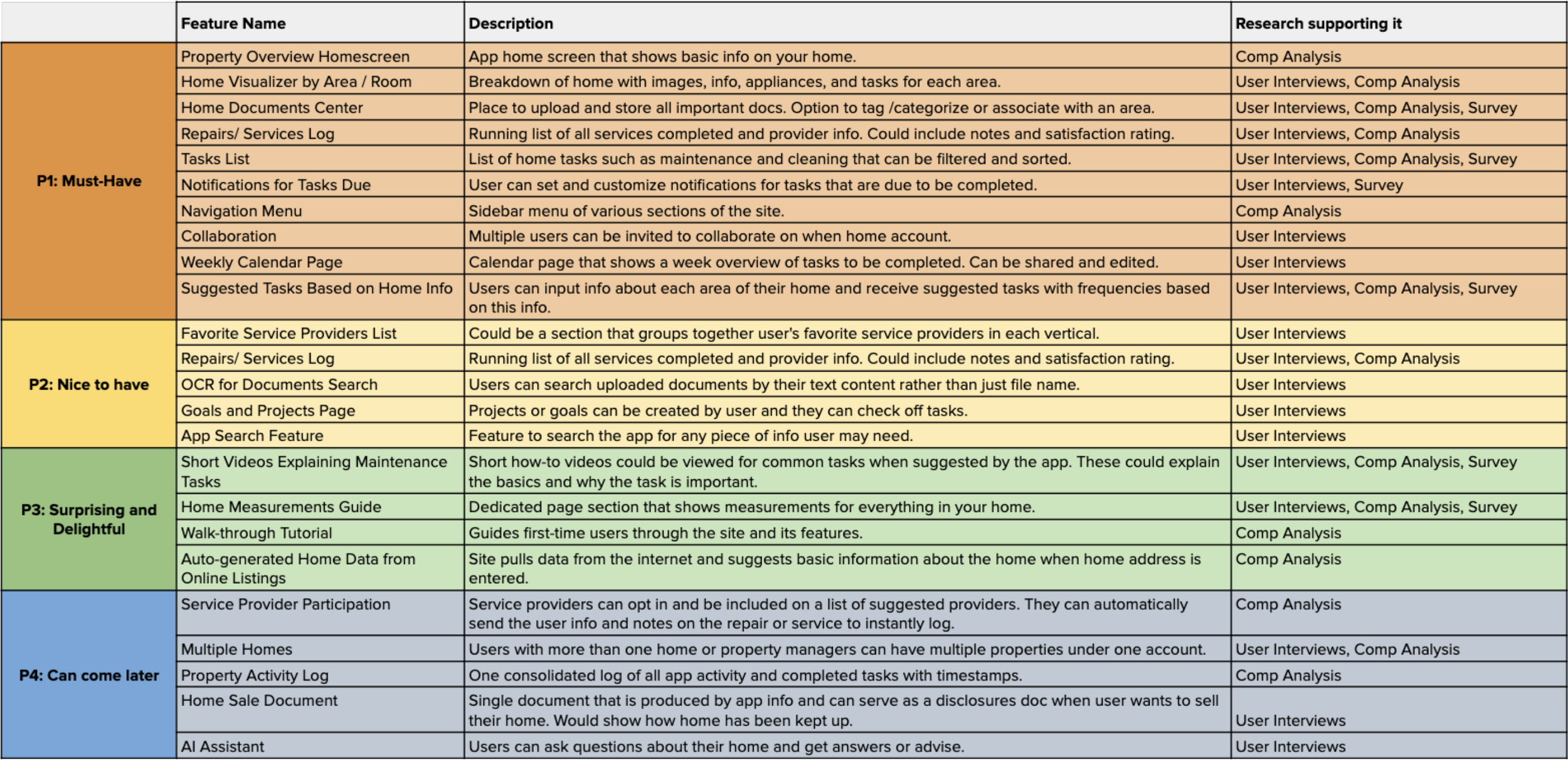
Features Roadmap
With my product goals clearly stated, it was time to create a set of features, assigning each one a level of priority based on their importance to both the business and users.
Design and Prototype
Card Sort
In order to determine how site content could be organized in a user-centric manner, I created a card sort. I chose an open card sort test where participants named the categories themselves because I felt this was appropriate for this particular project, given that the site itself would center around home organization. I wanted to see how users organize their home information mentally without influencing their choices
Number of Cards: 41
Type: Open card sort, online, not moderated
Number of Participants: 5

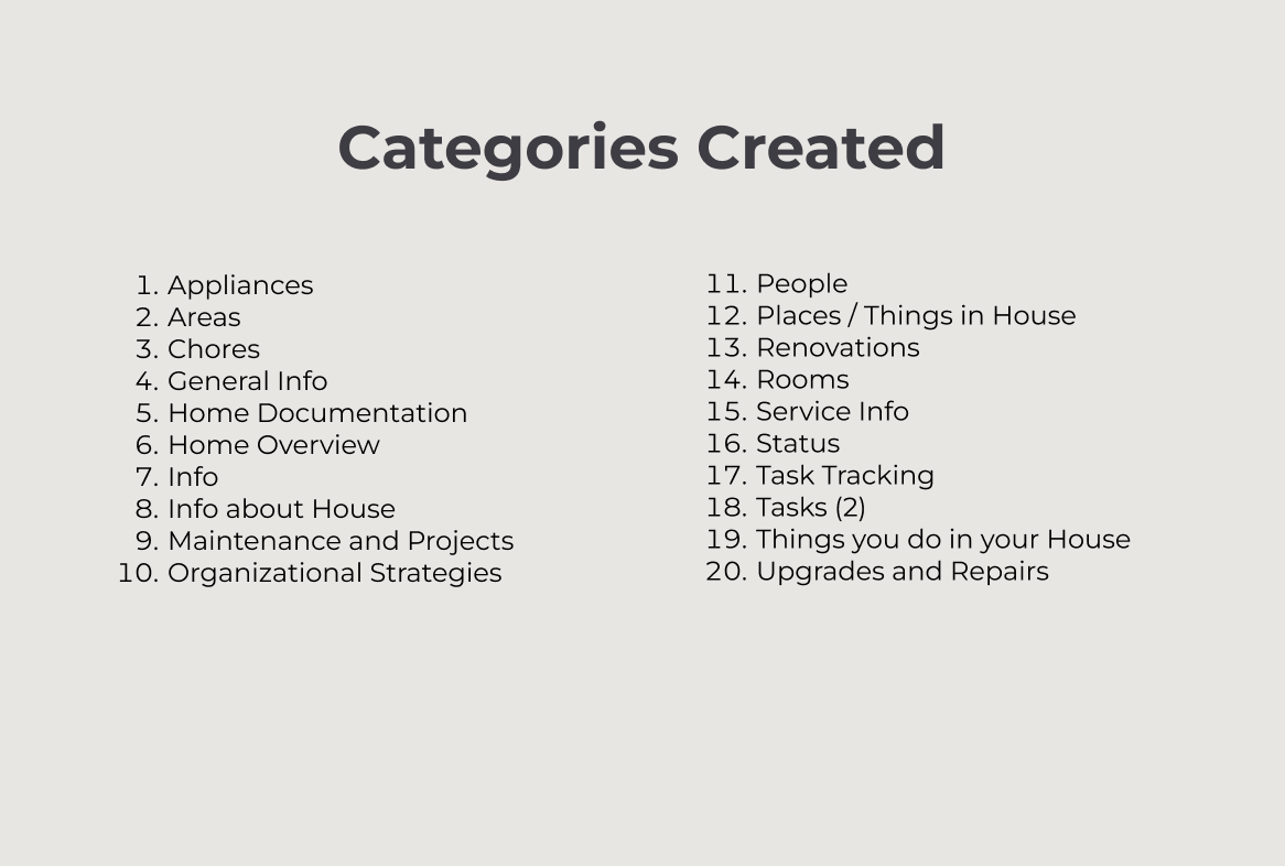
Key Takeaways:
Participants created separation between info about the home and actions done around the home.
The only exact match for categories among participants was “Tasks.” “Task Tracking” and “Chores” also appeared.
Some participants created a category for things that had been done to the home. These included “Upgrades and Repairs,” “Renovations,” and “Maintenance and Projects.”
The card for “Manuals” tended to be grouped with “Home Overview,” “Home Info,” and “Home Documents,” rather than “Appliances.”
Overall, there was significant variation, perhaps reflecting the struggle people have making sense of their home info, the main problem I set out to solve.
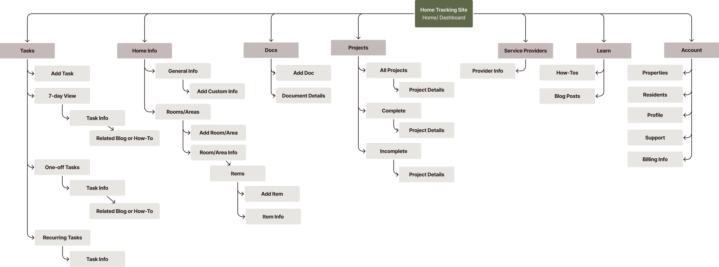
Information Architecture - Sitemap
I would now attempt to leverage the users’ mental models to diagram a sitemap. This was one of the more challenging parts of this project. I had learned that there was a great deal of variation in how users think about their home info.
The card sort helped guide how I would structure the site, but I knew from research that it would be important for sections of the site be interconnected, and that there needed to be guidance offered along the way via access how-tos, suggested tasks, and blog posts.
User Flows and Task Flows
I mapped out key flows for the site to start to visualize how users could move through the design. This process allowed my to identify complexities that I may not have thought of before.


Lo-Fidelity Sketches
With key flows mapped out, I took a look at several different organizational apps to explore various design patterns for inspiration, and started sketching some low-fidelity wireframes. I drew many different versions of key screens to get all my ideas out.

Mid-Fidelity Wireframes
Using Figma, I translated key screens into digital wireframes and started to get more granular about the layout of each screen. Seeing these screens in a digital format allowed me to get a better grasp of whether my lo-fi ideas were feasible.

At this stage, I shared my wireframes with peers and received helpful feedback on ways I could make the design more user-friendly moving into high fidelity, particularly with buttons and CTAs.
Branding
I reviewed user and business goals and began developing the core values and visual style of the brand. I created a mood board that reflected these ideas visually and designed the brand logo.

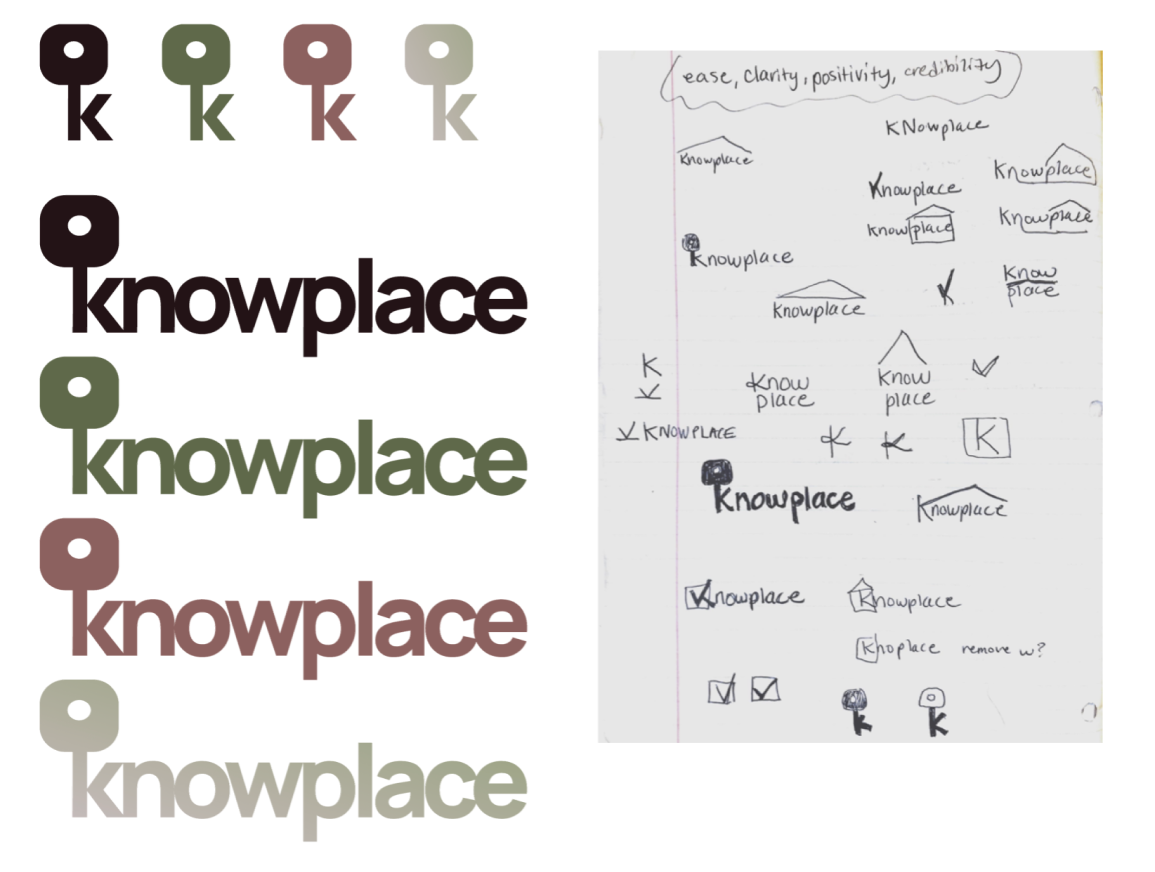
I chose to go for a simple logo that gives a small hint as to what the site is about while reflecting the core values. This version gave me the option to use the letterform key symbol. The key is a strong symbol for home and evokes a feeling of trust.
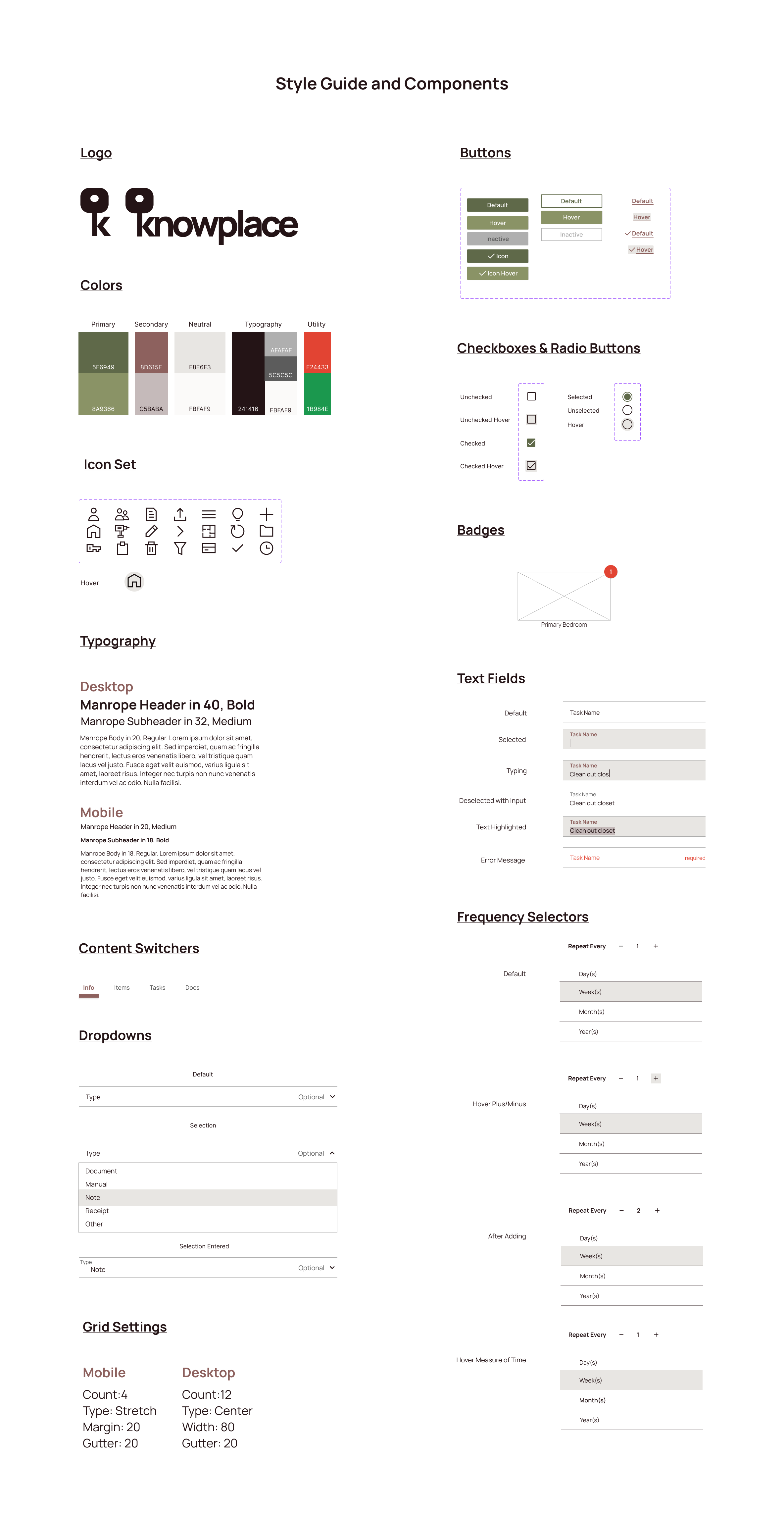
UI - Style and Components
My goal for the overall visual style of this design would be to create a feeling of simplicity and tranquility. Going back to my research, I knew that users generally felt overwhelmed in regard to home organization, and it was important to create a sense of clarity and ease here. Since users have the opportunity to upload photos I was mindful that the UI elements should not be competing with the colors of user-generated images.
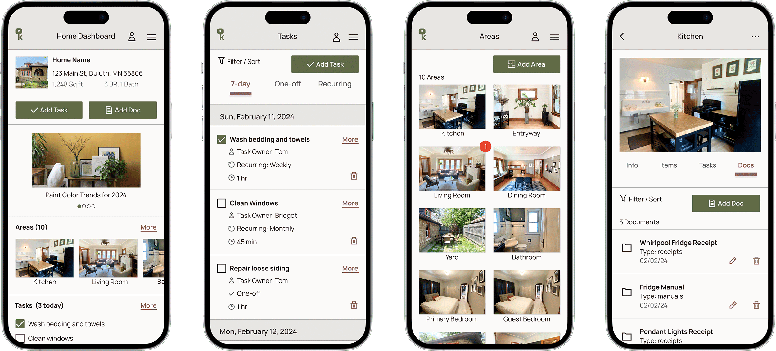
Hi-Fidelity Wireframes
I was now ready to apply the visual style and values I had developed to create polished hi-fidelity wireframes. I went through several different iterations of key screens, saving the each version for reference. I gathered more feedback, and once I was satisfied with my wireframes I created a prototype of key flows for usability testing.
Testing & Iteration
Usability Testing
With my Figma prototype I conducted usability testing of two key functions of the site.
Number of Participants: 5
Tool: Maze


Iteration
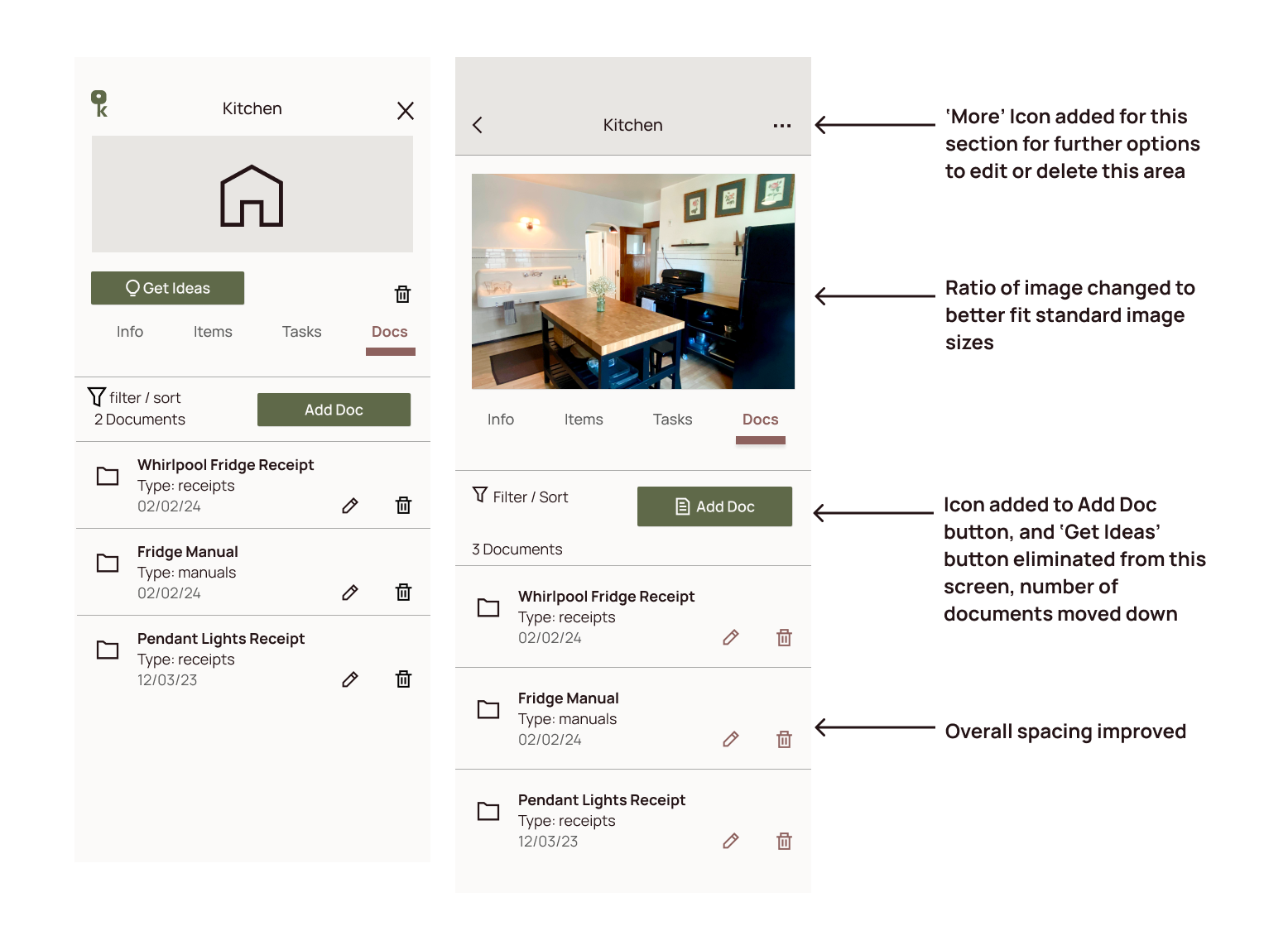
With valuable qualitative and quantitative insights gathered from testing, I made further iterations to better serve the user, directly responding to test results.

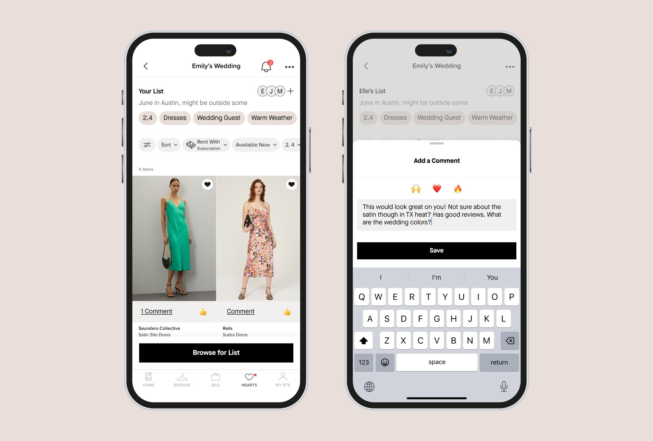
Final Prototypes
Adding a Custom Task
Adding a Document to an Area
Reflection
This project was full of lessons at every step. I started with a small observation and though research was able to gain a deeper understanding of a human problem. I learned to trust the research process and to always refer back to the most prominent pain points of the user through each step of the design process. One of the challenges with this particular project was that the issue of of home organization is a complex and personal one. This project underscored the idea that in UX design it is better to solve a couple of problems effectively than to partially solve every problem uncovered in research.
As I progress I am also learning the importance of balancing necessary conventions with imaginative design, and I have learned that very small iterations can make massive differences for the user. This was a rewarding project and has been instrumental for my growth as a designer.