Designing a responsive website from scratch for a local pilates studio
Project Overview
Project Type: Responsive Site Design
Role: UX/UI Design
Industry: Local Business
Team: Worked with studio owner and a developer
Time: 3 weeks for design, 2 weeks for development
Tools: Figma, Google Forms, Otter, Google Meet, Lyssna, Photoshop
Context:
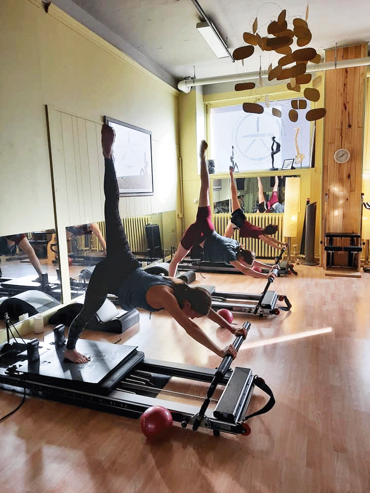
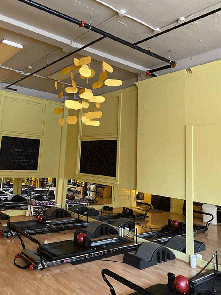
Personal Best is locally-owned pilates studio in Duluth, MN. Offering daily reformer pilates classes for all levels, the studio focuses on personalized attention in small groups. The two instructors combine challenging yet accessible workouts to improve strength, balance, and overall well-being.
Problem Identified:
Personal Best is Duluth's only reformer pilates studio, enjoying a strong local reputation. Despite its popularity, the studio lacks a website, hindering growth and efficiency. Challenges include scheduling, visibility, and educating potential clients about reformer pilates. As public interest in pilates grows, a website can address these concerns and attract potential clients looking to try something new.
Project Goal
My aim for this project was to create a welcoming, informative website that reflects Personal Best's studio atmosphere. The site should encourage booking and attract new clients, helping them overcome barriers to trying pilates.
Research
Methods: Competitive Analysis, User Interviews
Research Objectives:
Gather key information that users are looking for when considering a workout class/studio and how they generally interact with studio sites
Understand any pain points that currently exist for users when it comes to workout studio sites
Gain a sense of users’ perceptions of pilates
Discover ways that reformer pilates can feel more approachable to newcomers on the site
Understand what type of experience users are looking for when it comes to pilates classes
Assess the current competition within the community
Competitive Analysis
To kick off my research, I studied the online presence of a few local studios with similar offerings.
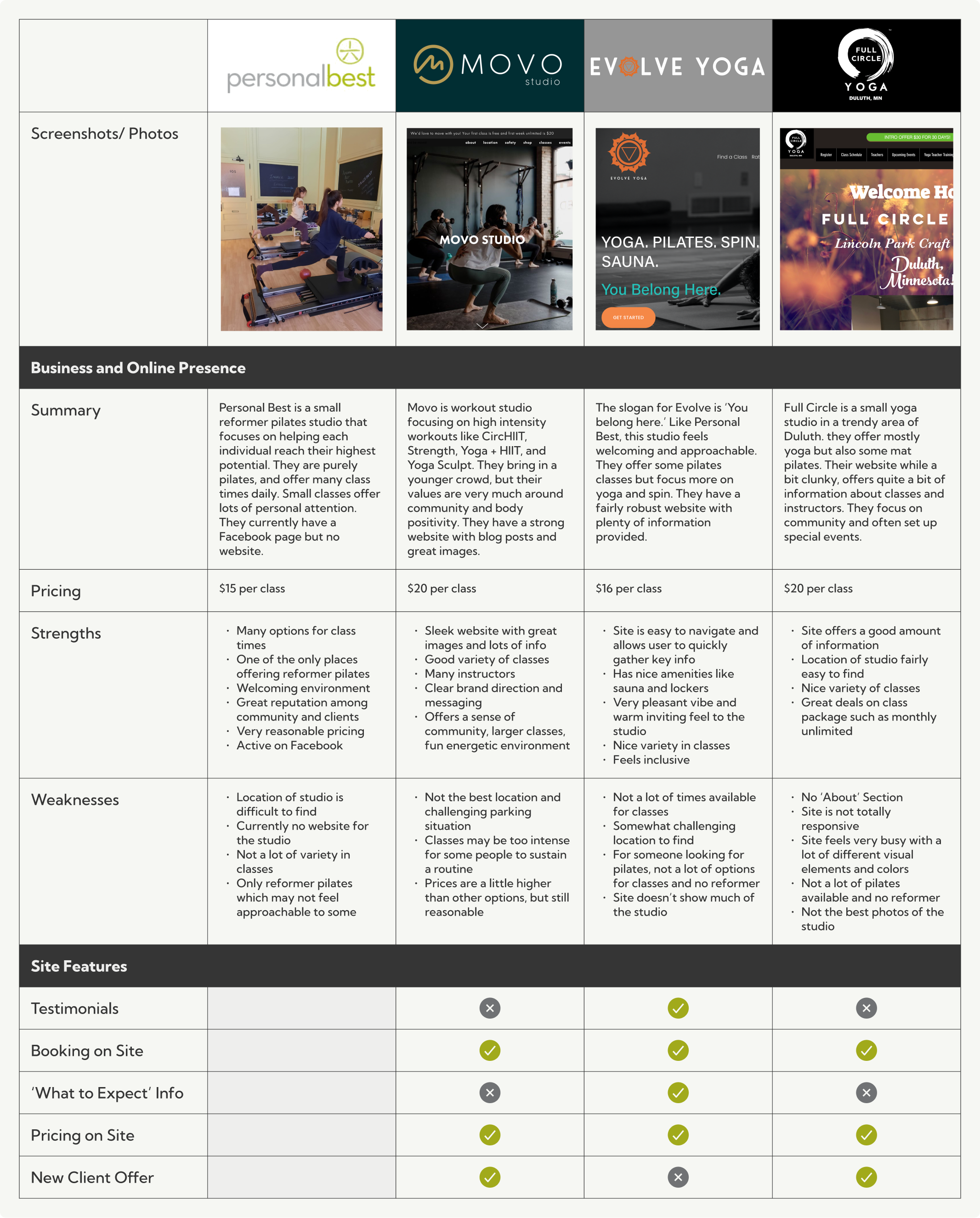
Competitive Analysis Summary:
I took a look at the offerings of the studios and their website designs. Overall, the competitor studios tended to have a pleasant local feel and fairly minimal friction for converting to bookings. I noted that Personal Best stood out for offering reformer pilates, much more class availability, and lower prices than the other studios. While the competitor studio sites had their strengths, there was an opportunity to create a site that offered clearer information, simpler booking, stronger imagery, and an overall more pleasant and welcoming feel.
User Interviews
I spoke with five different participants to gather insights on what type of experience potential users would desire. I wanted to focus on new clients, so I chose to speak to participants who were not familiar with the studio but had some knowledge of pilates.
Participant Info
5 total participants
American, English-speaking
Ages 25-55
Have tried workout classes
Various levels of familiarity with reformer pilates (3 have tried, 2 have not)
Learnings:
I was not surprised to hear that price and ease of booking were important to all interviewees. Another common theme was a desire for a laid-back, inclusive vibe, and clarity on what to expect ahead of time.

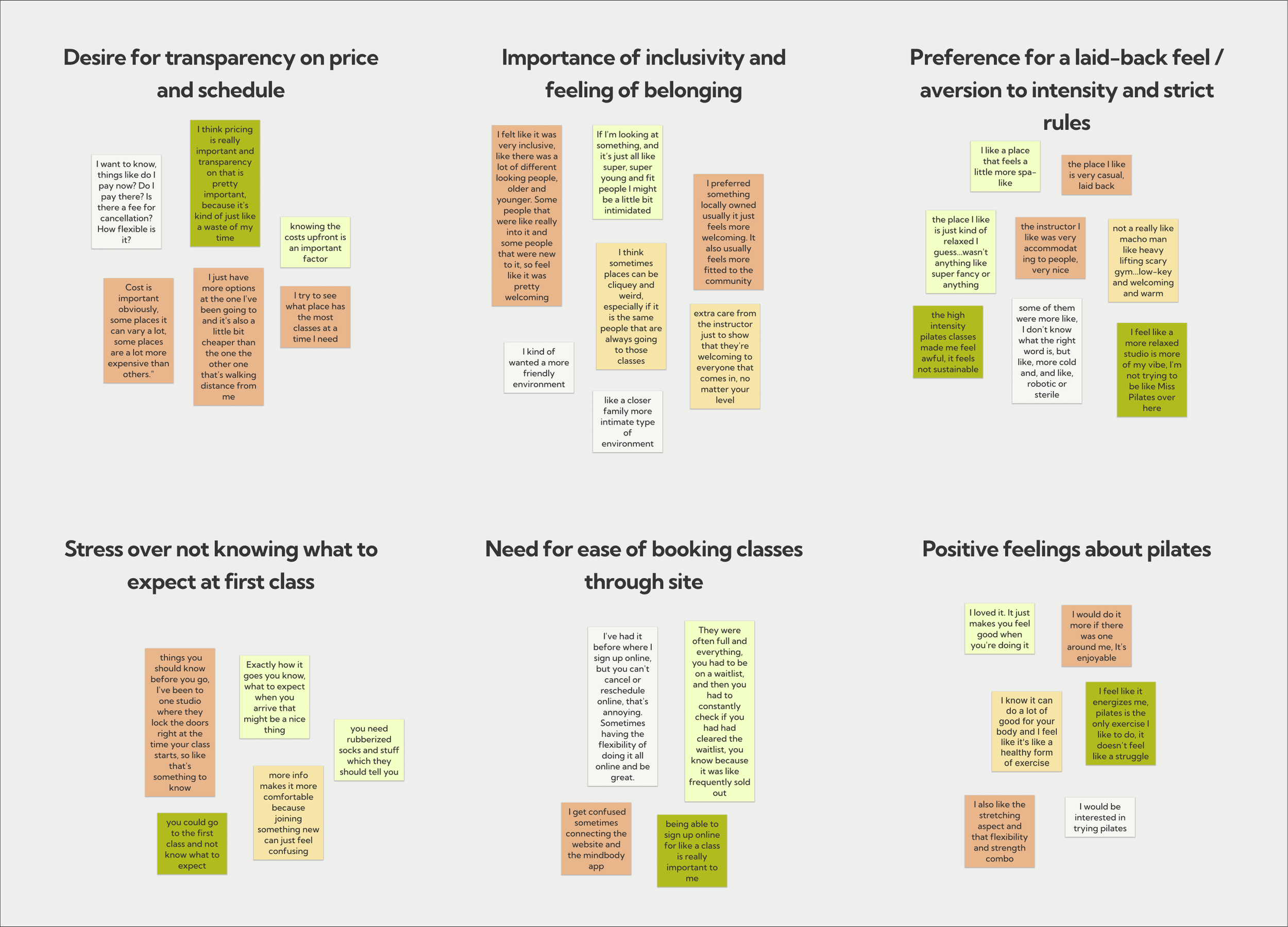
Users interviewed generally have positive feelings about workout classes and feel that they provide guidance and motivation that going to the gym does not provide
Not surprisingly, price ranks among the most important factors for choosing a workout class, and users appreciate transparency on pricing from studios when searching online
Users all stated that it is important to feel that they fit in with the crowd that goes to the studio, and they will look to the site to get a sense of this before going
There was a tendency among interviewees to be drawn to a more laid-back studio. A good workout is desired, but an atmosphere that feels too serious or intense is seen as a negative
The main stressors or pain points that users discussed centered around not knowing what to expect from classes and studios. Clear info about what to bring, what the rules are, when to arrive, what happens in the class are all valued
Convenience was also a major factor for users interviewed, and they like to know about things like parking and accessibility of the studio ahead of time
Aside from maybe some info about events or offers, users did not see a lot of reason to return to a studio’s site once they are a regular client, however they did note that the ability quickly find and schedule classes through the site is important
When asked what they are looking for in a studio, users seemed much less concerned about the specifics of the workouts and focused on the overall vibe of the studio. They wanted to feel comfortable and welcomed.
Pain Points:
Feeling unfamiliar with the way classes go and what is expected
Potentially not fitting in or feeling uncomfortable at certain studios due to age, body type, fitness level, or experience
Concern about too much intensity or strict rules
Pricing may not always be clear or options available may not be affordable
Studios my be hard to find or parking may be difficult to figure out from looking online
Personas
From these interviews, I formed three personas to represent users of the site.


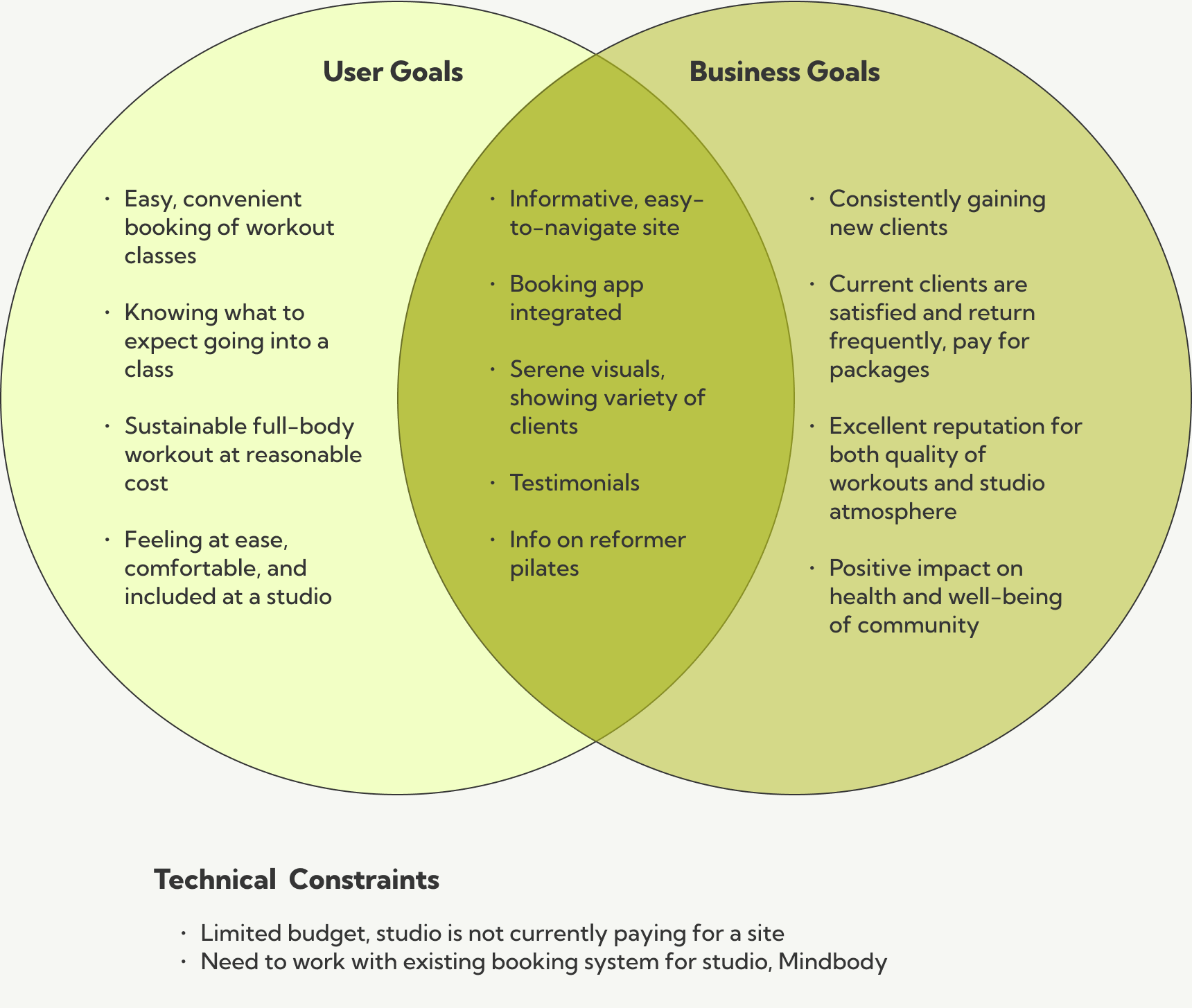
Project Goals
At this point I had a call with Carrie, the owner of the studio, to share ideas and discoveries and to get an understanding what she wanted in a site. Her goals for the business were very well-aligned with the goals of the user.
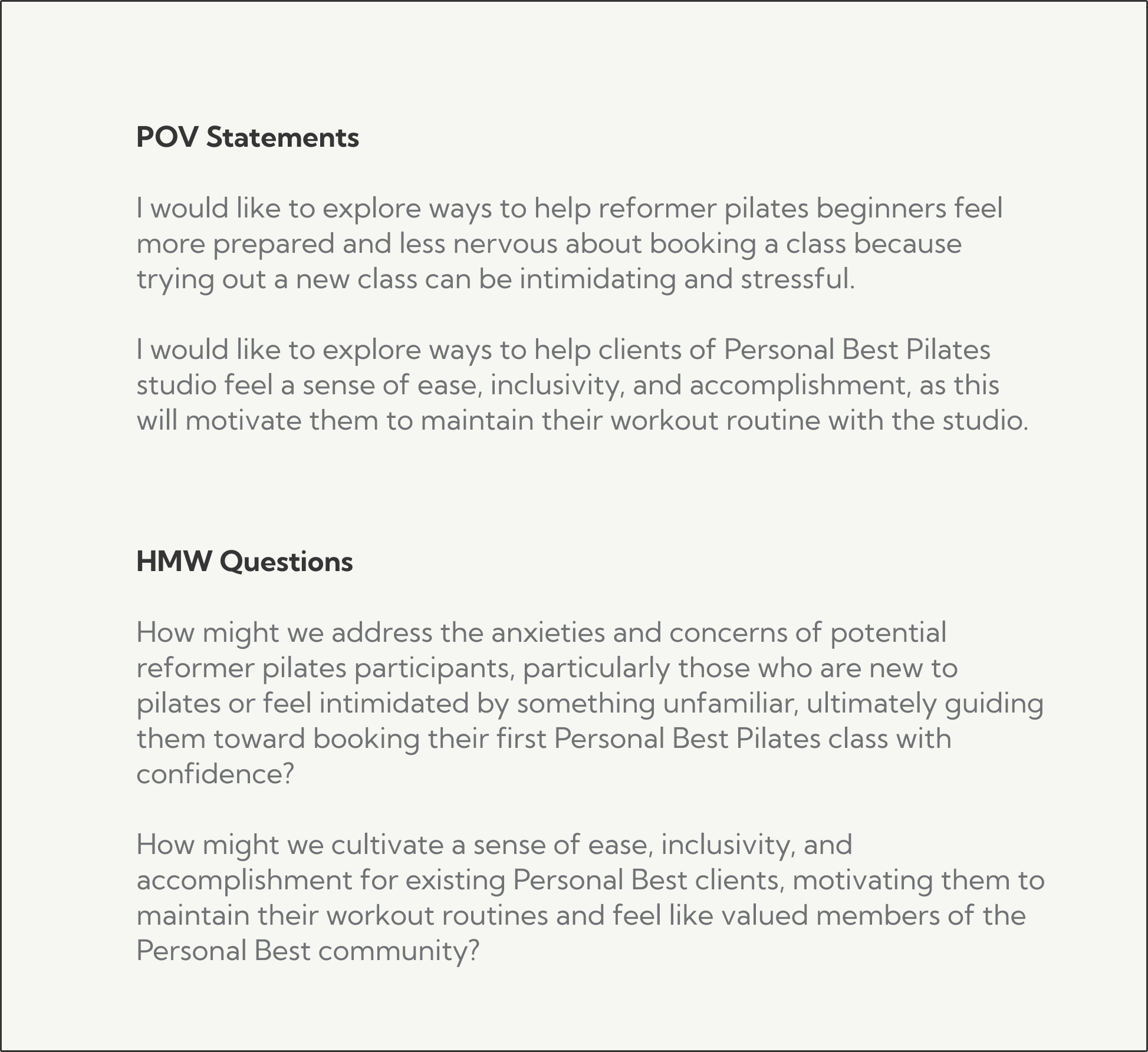
Problem Statement
To clarify the problem at hand, I crafted POV statements and “How Might We” questions based on my research.
Ideation
Features Roadmap
I listed out site features that would serve to create the right user experience to solve the problems uncovered in research and sorted them by priority.
Design and Prototype
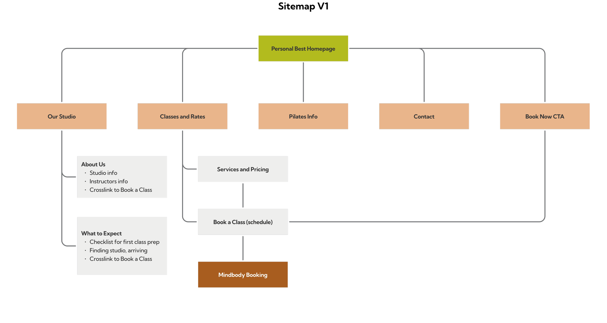
Information Architecture - Sitemap
I took a look at some other workout studio sites to understand how users might expect the site to be organized and created an initial sitemap.
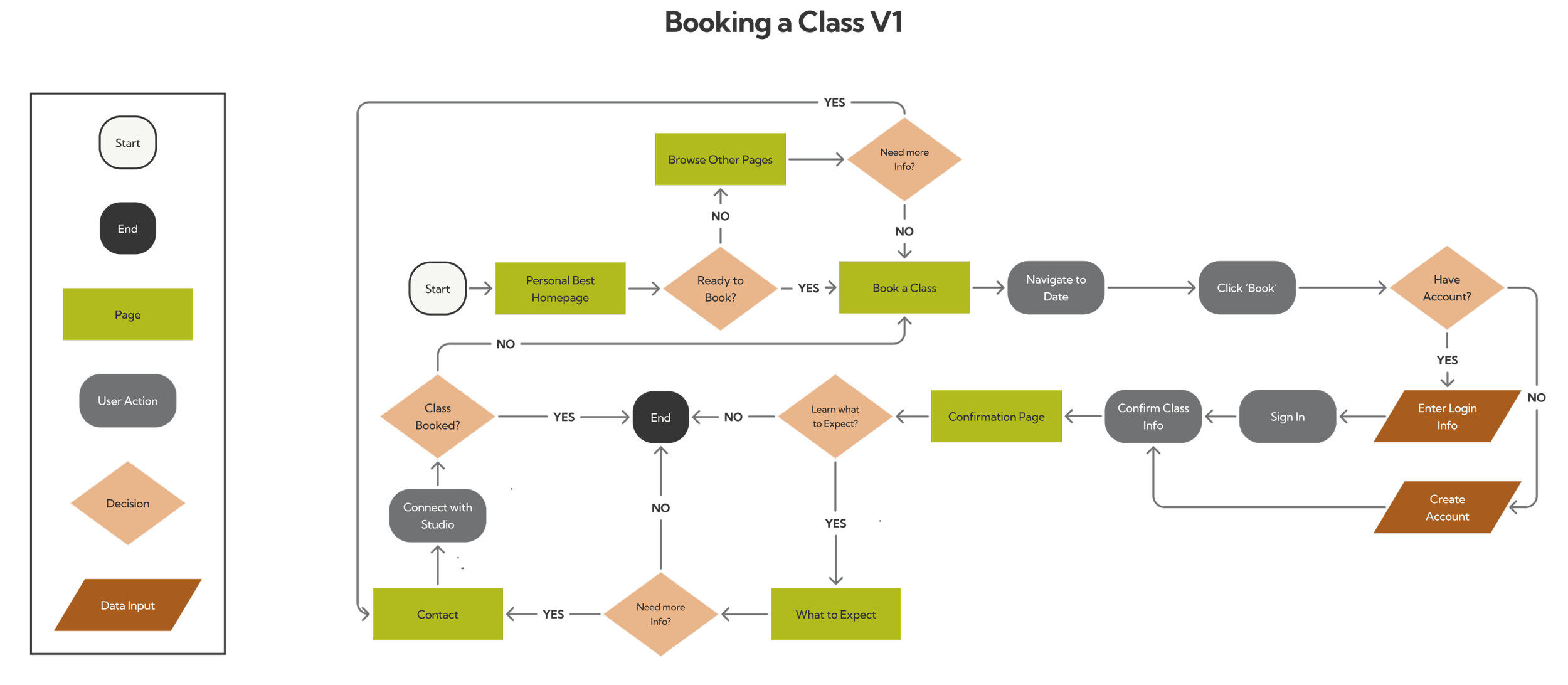
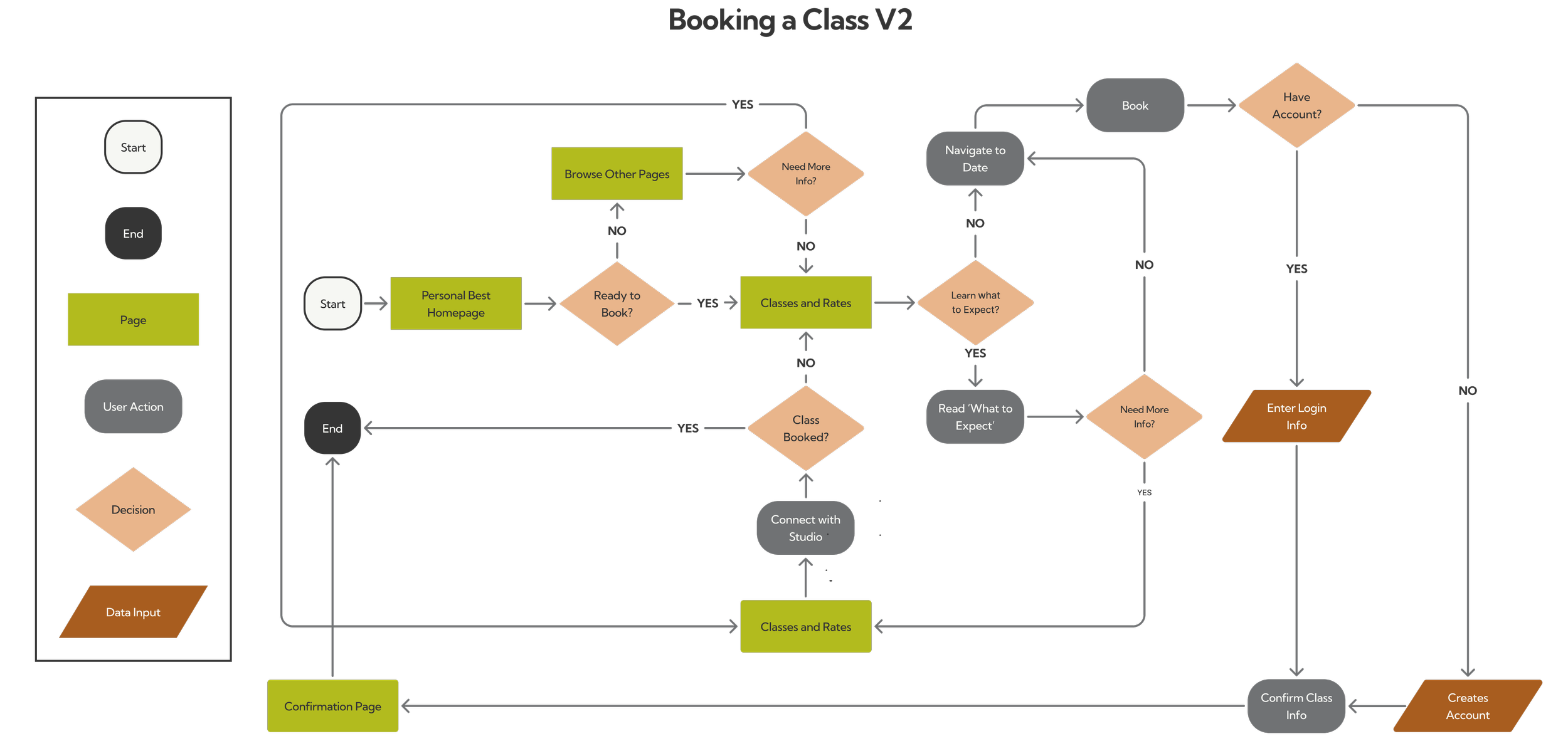
User Flow
The function of the site would be to lead users to booking a class, so I mapped out this flow.
Lo-Fidelity Wireframes
Once I had determined the intended architecture for the site, I drew up some sketches for both the desktop and mobile pages.

Lo-Fidelity Testing
I decided to do some testing at lo-fidelity to get feedback from users on the structure of the site. I asked users how they would gather certain information and also got their general impressions at this stage.
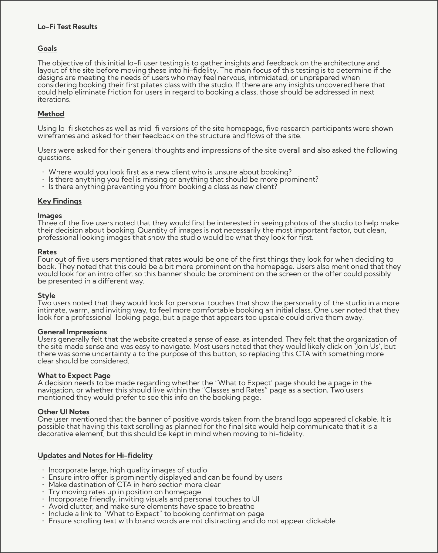
Revisions:
After working though lo-fi wireframes and receiving user and business owner feedback from lo-fi testing, I decided to consolidate navigation pages and turn the pages that were under “Our Studio” and “Classes and Rates” into sections.
I also chose to remove “Pilates Info” section as there does not seem to be enough content for this to justify a separate page. The “What to Expect” section was moved to the Classes and Rates page as a section.

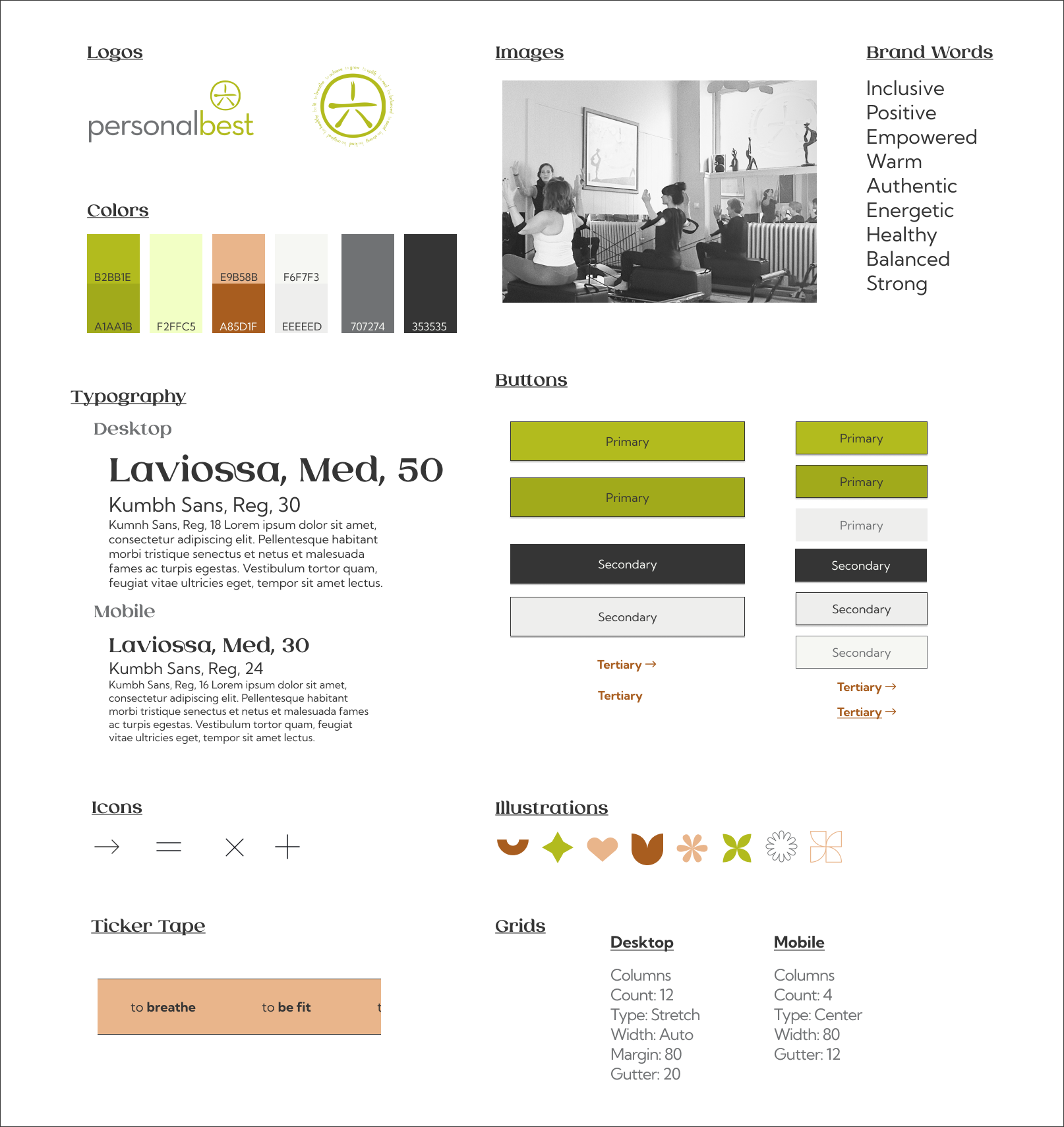
Style and UI
The owner of the studio had a nice logo to work with, but no other branding materials. She noted that she felt the green color of the logo was a bit loud, so we kept the use of that color minimal and built out a style around it that reflected the warm, inviting nature of the studio. I incorporated the inspiring, positive words around the brand mark logo into a ticker tape on the homepage.

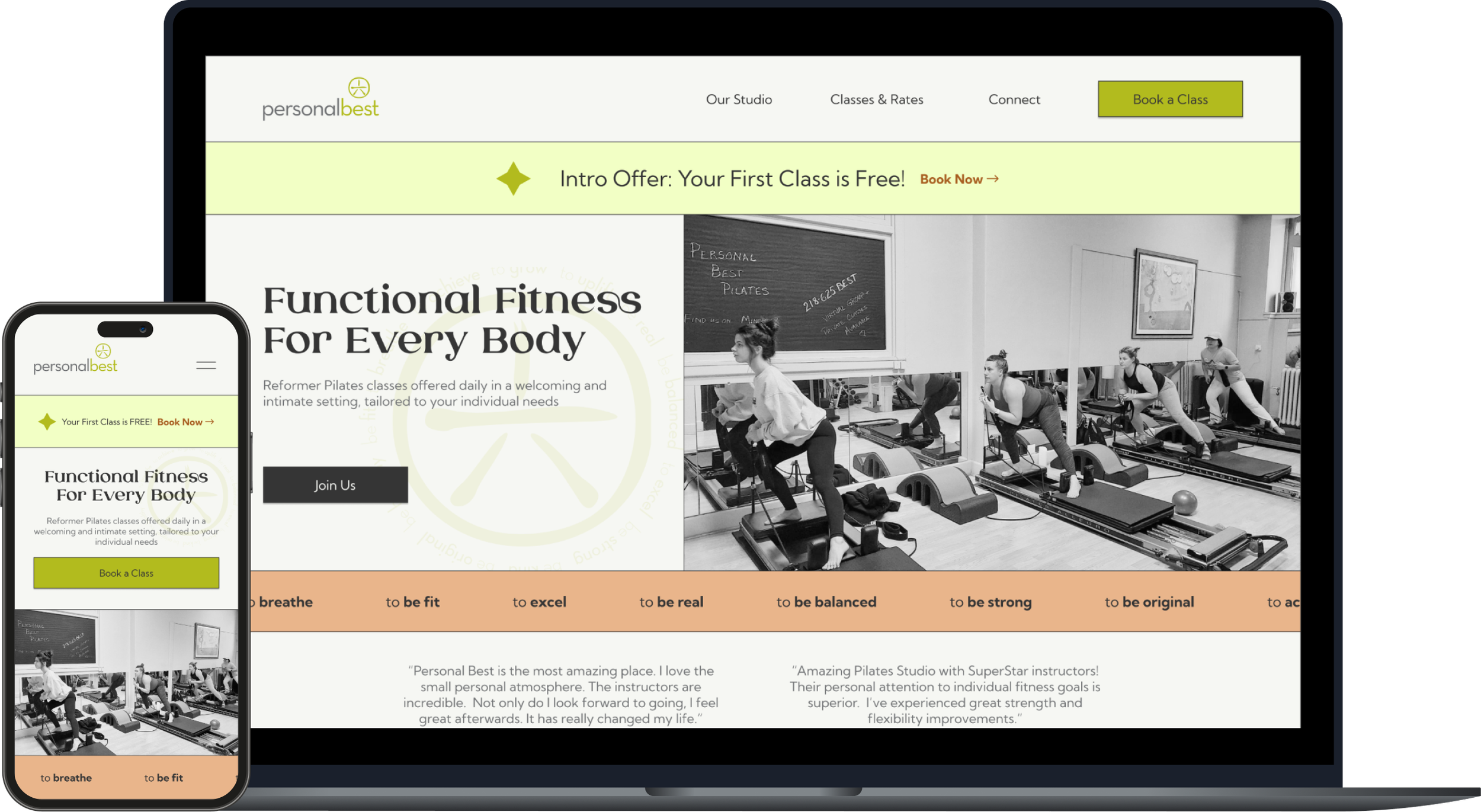
Hi-Fidelity Wireframes
My client was satisfied with the intended structure and style of the site. I was now ready to create my digital wireframes. Below are the final versions.
Testing & Iteration
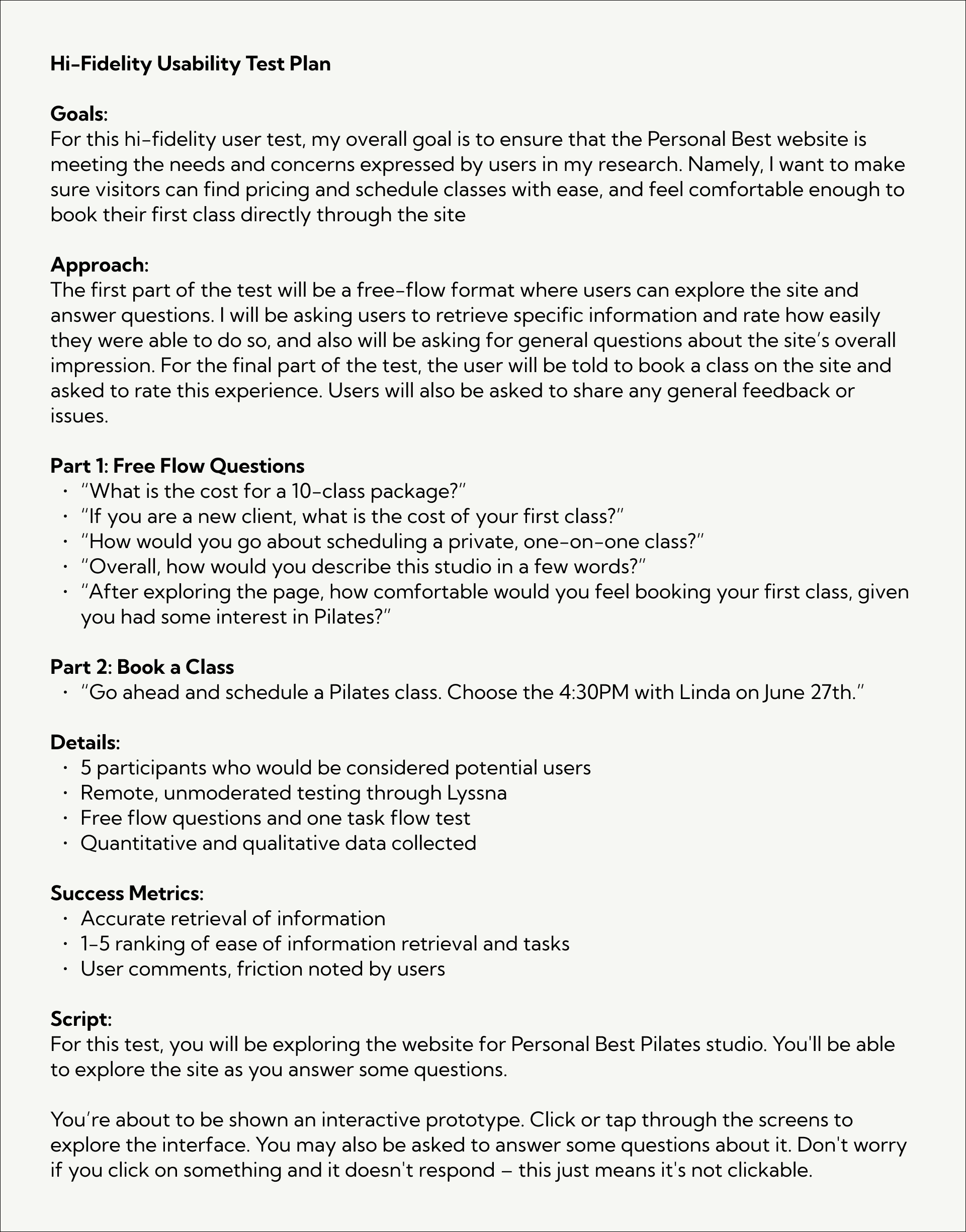
Hi-Fidelity Usability Testing
I created a prototype in Figma and conducted hi-fidelity usability testing.
Number of Participants: 5
Tool: Lyssna
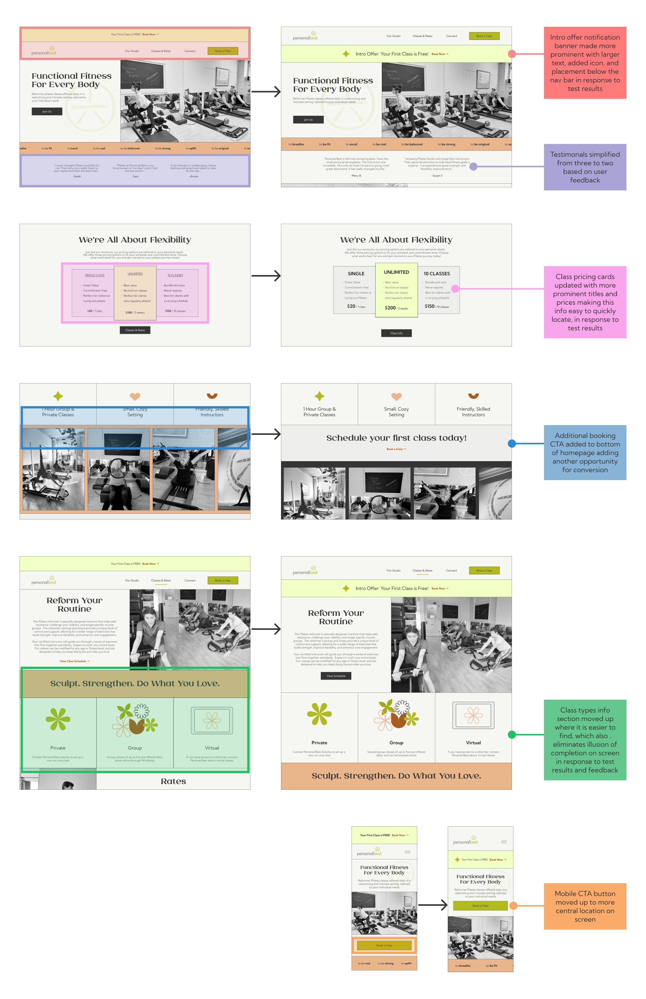
Iteration
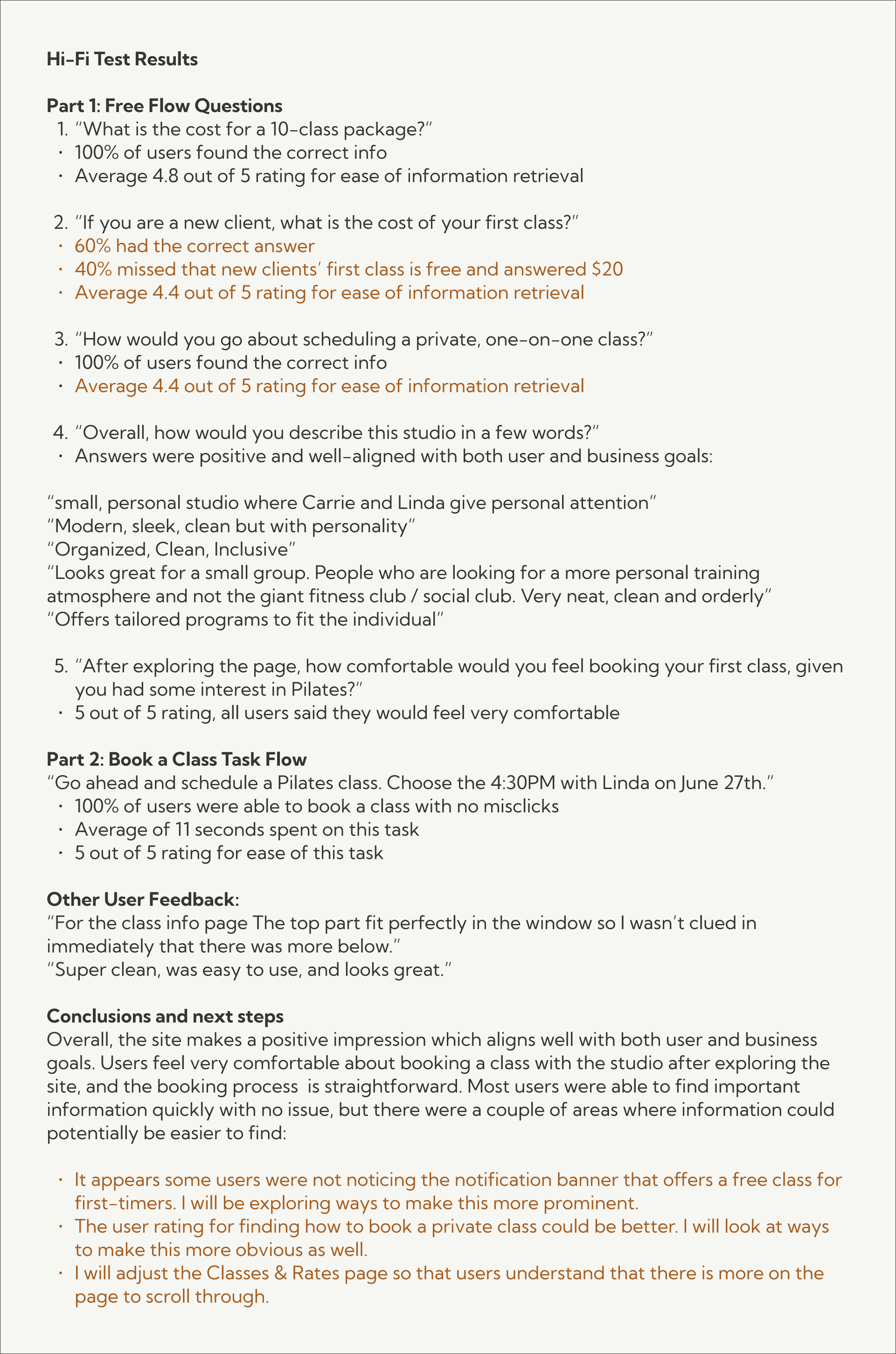
From my test results, I was able make some key iterations that would improve usability and result in better conversion for the studio.
Final Prototypes
Desktop
Mobile
Reflection
This project gave me the opportunity to design and implement a site for a local business, and helped me develop skills collaborating directly with stakeholders, ensuring their goals are being met in addition to those of the users. The studio owner was very pleased with the result and decided to move forward with my design which is now live. I really enjoyed taking the overall feeling and message the business was going for and translating that into a digital product. I liked the challenge of taking the few branding pieces the studio had to work with and building a design around them.
Some of the biggest challenges were the technical constraints that exist for the studio. They did not have an existing website and currently use Mindbody for booking of classes. I wanted to keep the project realistic in hopes of delivering something that they could actually use with a limited budget.
This project also provided valuable experience in communicating with a developer. I learned that this part of the process can be just as crucial as the design stage. In dealing with discrepencies between the initial design and the live sight, I gained valuable insights into how developers work and how to clearly communicate my design intentions to ensure they are actually reaching the user as part of the final product.